
Musings is an informal newsletter mainly highlighting recent science. It is intended as both fun and instructive. Items are posted a few times each week. See the Introduction, listed below, for more information.
If you got here from a search engine... Do a simple text search of this page to find your topic. Searches for a single word (or root) are most likely to work.
Introduction (separate page).
This page:
2019 (May-August)
August 28
August 21
August 14
August 7
July 31
July 24
July 17
July 10
July 3
June 26
June 18
June 12
June 5
May 29
May 22
May 15
May 8
Also see the complete listing of Musings pages, immediately below.
All pages:
Most recent posts
2026
2025
2024
2023:
January-April
May-December
2022:
January-April
May-August
September-December
2021:
January-April
May-August
September-December
2020:
January-April
May-August
September-December
2019:
January-April
May-August: this page, see detail above
September-December
2018:
January-April
May-August
September-December
2017:
January-April
May-August
September-December
2016:
January-April
May-August
September-December
2015:
January-April
May-August
September-December
2014:
January-April
May-August
September-December
2013:
January-April
May-August
September-December
2012:
January-April
May-August
September-December
2011:
January-April
May-August
September-December
2010:
January-June
July-December
2009
2008
Links to external sites will open in a new window.
Archive items may be edited, to condense them a bit or to update links. Some links may require a subscription for full access, but I try to provide at least one useful open source for most items.
Please let me know of any broken links you find -- on my Musings pages or any of my web pages. Personal reports are often the first way I find out about such a problem.
August 28, 2019
Pavlovian plants: a follow-up. In an earlier post, we noted an article suggesting that plants could show Pavlovian responses. Pea plants learned to associate a fan with food, and would grow toward the fan even if that path did not lead to food. It's controversial work. Some use such work to suggest that plants have consciousness. Others object to that interpretation. We now have am "opinion" article from a group of skeptics. As before, I encourage people to try to understand the experiments that have been done, and the basis of the differing views. Understanding nature is good; semantic debates may not be so good. The goal here is to stimulate discussion and understanding, not to reach a verdict.
* News story: Botanists Say Plants Are Not conscious. (C-Y Hou, The Scientist, July 5, 2019. Now archived.)
* The "opinion" article: Plants Neither Possess nor Require Consciousness. (Lincoln Taiz et al, Trends in Plant Science 24:677, August 2019.)
* Background post: Can a plant learn to associate a cue and a reward? (March 3, 2017).The article discussed in this background post is reference 29 of the current article. The current authors discuss the earlier work at some length. They note an attempt to reproduce the earlier work, which is not yet published, and which seems to have yielded complex results.
August 27, 2019
4.4x10²⁰.
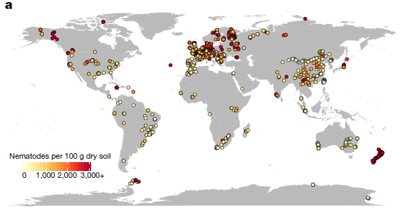
How many worms are there on Earth? Perhaps you have wondered about it. Now we have a number. To be more specific, it is an estimate of the number of nematode worms in the top layer (15 cm) of soil. Nematodes, commonly called round worms, are the most abundant animals on Earth (they are tiny).
Here is a map showing where they are...
|
The map shows the density of nematode worms. in number per 100 grams of soil. That density is color-coded; see the color bar. Light colors are for high densities (as many as 19,000 worms per 100 grams soil); dark colors are for low densities (as low as 100 worms per 100 g soil -- which is one worm per one gram soil). (Does anyone else find that color coding "backwards"?)
The map shows worm densities. It's a little math to get from the densities to a worm count. This is Figure 3 from the article. |
How did the scientists get that? Well, it's an estimate. They sampled a number of locations, then developed a computer model that allowed them to calculate an expected value for very location on Earth.
They sampled 6,759 locations, as summarized on the following map...
|
The figure shows the results from their samples. As before, there is a color code to show the worm density at each site. Note that the color code here is very different from the one in the top figure.
This is Figure 1a from the article. |
What do we learn from all this? The top map shows a striking pattern. There is quite a north-south gradient in soil nematode prevalence on Earth. That is unusual; in general, animals are more abundant in the tropics.
There are some exceptions and special cases. South America seems to have its own east-west gradient of nematodes. And New Zealand's prevalence of soil nematodes seems odd. The level of soil organic carbon (SOC) is one factor that correlates with nematode abundance, but there is much more to be learned.
The scientists actually did more than just count the nematodes in their samples. They classified them, mainly by what type of food the worms ate. So the article contains data about the prevalence of difference types of nematodes.
One thing scientists do is to measure things. Count things. The work provides some basic numbers about Earth that we did not know before. It's a step toward understanding the complex biology of soil. And it satisfies our curiosity.
News stories:
* Global study of world's most abundant creatures published today in Nature. (Asian School of the Environment, Nanyang Technological University, July 31, 2019.)
* There are 57 billion nematodes for every human on earth; Understanding them will help address climate change. (T Hollingshead, BYU, July 31, 2019.)
* News story accompanying the article: Ecology: Global maps of soil nematode worms. (N Eisenhauer & C A Guerra, Nature 572:187, August 8, 2019.)
* The article: Soil nematode abundance and functional group composition at a global scale. (J van den Hoogen et al, Nature 572:194, August 8, 2019.)
More nematodes:
* Engineering a worm to treat cancer (July 23, 2022).
* What can we learn from 17,000-year-old cat feces? (September 16, 2019).
* How to avoid cannibalism (May 25, 2019).
* Extending lifespan by dietary restriction: can we fake it? (August 10, 2016). A post about a nematode that is a workhorse of lab research, Caenorhabditis elegans.
* How does worm "fur" divide? (January 4, 2015).
* Why would a plant have leaves underground? (January 21, 2012).Other counts include...
* Briefly noted... How many ants are there? (December 10, 2022).
* Counting trees on Earth from space -- at one-tree resolution (January 12, 2021).An attempt to count everything: The ultimate census: the distribution of life on Earth (June 22, 2018). The article of this earlier post is reference 36 of the current article. The current authors note that their estimate of global nematode biomass is considerably higher than estimated just a year ago in the broader survey.
August 26, 2019
Almonds are a major food crop. But the "natural" form of almonds is not so good. Very bitter, and quite poisonous. Both of those features are due to a chemical called amygdalin. When we ingest amygdalin, our metabolism releases hydrogen cyanide from it. Turning almond into an important human food required domestication. We have limited knowledge about the history of almonds.
A recent article reports sequencing the genome of almonds: ancient "bitter" almonds and modern "sweet" almonds. Interestingly, the scientists find a single mutation that is responsible for this one important change.
The following figure shows how amygdalin is made in almonds. It also shows the levels of the relevant enzymes in sweet and bitter almonds.
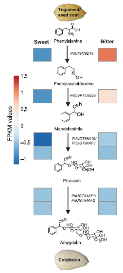
|
The central part of the figure shows the biochemical pathway for making amygdalin. It starts with the standard amino acid phenylalanine (top). The top two steps lead to a nitrile group (also called cyano; -CN) at the right. The next two steps add two sugars, leading to amygdalin (bottom).
The genes for the enzymes that carry out those steps are all known. What is shown here is the level of those enzymes in the two types of almond. Actually, what is measured here is the level of the messenger RNA for the enzymes; that is often (but not always) usefully related to the enzyme level. That level is shown by the color-coded boxes; there is a color key at the left, labeled FPKM. You can see that the boxes for the last two steps are about the same for the two almond strains. But for the first two steps; the bitter almonds have red boxes, and the sweet almonds have blue boxes. Check the color code, and you see that the sweet almonds have very low levels of the enzymes for the first steps in making amygdalin. This is Figure 2 from the article. |
That figure tells us the biochemical difference between bitter and sweet almonds. But what is the genetic difference behind that biochemical difference?
In the new work, the scientists sequenced the genomes for bitter and sweet almonds. Of particular interest, they looked at the genome sequences for the region thought to contain the mutation leading to sweet almonds. It showed differences in a group of transcription factors: proteins that help choose which genes get transcribed into messenger RNA.
There are five such transcription factor genes in that group. The scientists tested each one, and found that one of them was responsible for transcribing the genes for the first two steps shown above. The specific genetic change they found for that gene explained the biochemical difference. That genetic change, it would seem, was a key step in domesticating the almond.
Knowing this genetic change may help scientists uncover the history of the almond. They may be able to test whether archeological samples of ancient almonds were bitter or sweet -- if they can get some almond DNA from the sample.
Miscellaneous...
You may have heard of amygdalin. It is a component of apricot seeds. We don't eat apricot seeds, but the amygdalin has gotten attention (because of a claim, probably incorrect, that it is useful in treating cancer). Interestingly, the almond and apricot are closely related. Others in the family include apple, peach and cherry. For most of those, we eat the flesh of the fruit. The almond is the only one where we normally eat the seed itself.
The article notes that "death by peach", using the seeds, was practiced in ancient Egypt as a form of capital punishment. The article provides references.
This is a local-interest story. A California story. About 80% of the world's commercial almond crop is grown in California. (The article is from universities in Europe.)
News stories:
* Almond Genome Sequenced. (Sci.News, June 17, 2019.)
* Sequencing the almond reveals how it went from bitter to sweet. (B Yirka, Phys.org, June 17, 2019.)
* Danish researchers unravel how toxic almonds became edible. (University of Copenhagen, June 17, 2019. Now archived.)
The article: Mutation of a bHLH transcription factor allowed almond domestication. (R. Sánchez-Pérez et al, Science 364:1095, June 14, 2019.)
Another story of cyanide poisoning from a food crop: Briefly noted... Cassava poisoning. (April 24, 2019).
The enzymes for the first two steps in making amygdalin (the two enzymes that are reduced in the sweet strain) are cytochrome P450 oxidases. Another post about this class of enzyme: Reconstructing an ancient enzyme (February 26, 2019).
More cyanide, in a more constructive role: Modeling the role of hydrogen cyanide in the pre-biotic formation of life's chemicals (September 8, 2019).
Other domestication posts include...
* Will a wolf puppy play ball with you? (February 7, 2020).
* The oldest known dog leash? (January 23, 2018).
* What can we learn from a five thousand year old corn cob? (March 21, 2017).Other California posts include...
* Formation of the Moon: the California connection (October 10, 2014).
* Groundwater depletion in the nearby valley may be why California's mountains are rising (June 20, 2014). There is even an almond connection here... The almond crop is water-intensive; the increasing growth of almonds in California is exacerbating water problems.There is more about genomes on my page Biotechnology in the News (BITN) - DNA and the genome. It includes an extensive list of related Musings posts.
August 24, 2019
Can we predict that an organ failure is imminent, so that we can introduce treatment before the crisis?
Can AI (artificial intelligence) predict that an organ failure is imminent?
A recent article reports some progress using AI to predict kidney failure. As often with AI, the article has provoked controversy. The goal here is to give an idea of what the scientists tried to do, what they accomplished, and why there are reservations.
The following figure serves to frame the discussion.
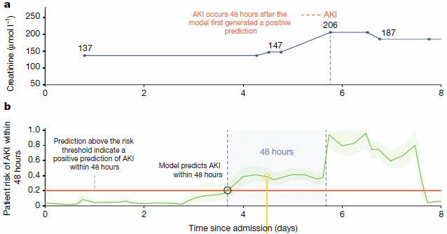
|
Both parts of the figure show some parameter plotted against time (days in the hospital).
Part a (top) shows some actual data for one patient. The parameter plotted is blood level of the chemical creatinine. The level is (apparently) stable for a while, then starts to rise on day 4. About two days later, the creatinine level rises dramatically: AKI (acute kidney injury). It is the kidneys' job to clear excess creatinine from the blood; high creatinine level is a marker for kidney failure. But that early blip (day 4) is not a reliable predictor; by the time creatinine rises significantly, the damage has been done. Part b (bottom) shows how the AI model developed in the article works. What's plotted on the y-axis is a probability value (green line) from the AI system: the p that AKI will occur (within 48 hours). The red line marks a threshold (p = 0.2), which turns out to be a useful predictor. You can see that the p value is low for a while, then reaches 0.2 at day 4. A warning. Two days later, p shoots up, reflecting the kidney failure. This is part of Figure 1 from the article. |
What is the basis of the AI prediction? Well, we don't know. The computer figured it out after being trained on a large data set from hospital records. We don't know what it did. (It does report the reasons for each specific prediction it makes.)
How well does it actually work? Let the authors speak for themselves. Here are two sentences from near the end of the abstract...
Our model predicts 55.8% of all inpatient episodes of acute kidney injury, and 90.2% of all acute kidney injuries that required subsequent administration of dialysis, with a lead time of up to 48 h and a ratio of 2 false alerts for every true alert. ... Although the recognition and prompt treatment of acute kidney injury is known to be challenging, our approach may offer opportunities for identifying patients at risk within a time window that enables early treatment.
Is that good? Perhaps that is not the right question. It is a development. We do not yet know what such a system can ultimately do. That is for future work.
The work reported in this article was based on electronic records of past patients. About 700,000 of them. A portion of the available data set was used for training the computer. The resulting proposed algorithm was then tested on a separate subset of the data. It has not been tested "live".
News stories. As you read these news stories, note the range of views and questions.
* Using AI to predict acute kidney injury. (B Yirka, Medical Xpress, August 1, 2019.)
* Kidney Injury and Artificial Intelligence Still Not Ready for Prime Time. (C Dinerstein, American Council on Science and Health (ACSH), August 5, 2019.)
* Google's DeepMind follows a mixed path to AI in medicine -- The DeepMind unit of Google is finding ways to detect deterioration in patients in hospitals, but it's not ready for primetime; instead, the software that's actually making a difference is a simple mobile alerts app. (T Ray, ZDNet, August 2, 2019.) More of a computer perspective here.
* Using AI to give doctors a 48-hour head start on life-threatening illness. (M Suleyman & D King, DeepMind, July 31, 2019.) From the AI company doing the work. The authors of this page are two of the authors of the article.
* Expert reaction to study on a deep learning approach to predicting acute kidney injury. (Science Media Centre, July 31, 2019.) As usual from this source, a range of opinions from knowledgeable people.
* News story accompanying the article: Medical research: Deep learning detects impending organ injury. (E J Topol, Nature 572:36, August 1, 2019.)
* The article: A clinically applicable approach to continuous prediction of future acute kidney injury. (N Tomašev et al, Nature 572:116, August 1, 2019.)
There are two additional articles published recently (July 2019) on related issues. The authorship is overlapping among the three articles. The additional articles are freely available. The ZDNet and DeepMind news stories link to both of them. (The ACSH story refers to one of them, but has an incorrect DOI for it.) This post does not discuss either of these other articles, but they are possibly of interest to some readers.
* * * * *
Among posts on artificial intelligence...
* Help design a new alphabet (March 1, 2016).
* Robots that can quickly adapt to disabilities (June 23, 2015).Does AI always mean artificial intelligence? Apparently not... When rivers (or streams) join, what is the preferred angle between them? (April 18, 2017).
Among kidney posts...
* Kidney regeneration in small rodents (December 14, 2021).
* WAK: Early clinical trial is encouraging (July 1, 2016). Links to more.
August 21, 2019
Two related items. They deal with the recently discovered group of archaea known as Asgard, which have been suggested to be a key link between prokaryotes and eukaryotes. The first is a news feature, with a general overview of the Asgard story. The second is a preprint of a specific new finding.
1. An update on the Asgards (and Lokis). (Asgard is a superphylum; Lokiarchaeota is a phylum within Asgard.) A news feature gives a nice overview.
* News feature: The trickster microbes that are shaking up the tree of life -- Mysterious groups of archaea - named after Loki and other Norse myths - are stirring debate about the origin of complex creatures, including humans. (T Watson, Nature News, May 14, 2019. In print: Nature 569:322 May 16, 2019.)
2. Asgard in culture. So far, the Asgards have been known only from metagenomics: accumulated DNA sequences that imply an organism. We now have the first report of an Asgard being grown in lab culture. This is a significant development, regardless of how we end up classifying these novel microbes.
* News story: Elusive Asgard Archaea Finally Cultured in Lab -- The 12-year-long endeavor reveals Prometheoarchaeum as a tentacled cell, living in a symbiotic relationship with methane-producing microbes. (N Lanese, The Scientist, August 12, 2019. Now archived.) Links to the article, which is freely available as a pre-print.
* The article has now been published; it is discussed in the post: An Asgard in culture (February 4, 2020).
Background post... Our Loki ancestor? A possible missing link between prokaryotic and eukaryotic cells? (July 6, 2015). Links to more.
August 20, 2019
Hematopoietic stem cells (HSC) are stem cells of the blood-forming system. They are useful therapeutically as well as for research.
Supplying HSC in large numbers is still difficult. A new article reports some progress, for mouse HSC.
The following figure shows the idea...
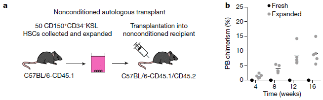
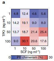
|
Part a (left) shows the experimental design, at least in part. Stem cells were isolated from a donor mouse at the left. For the main part of the experiment, a very small number of such cells (50) were taken and "expanded" -- grown in lab culture for about a month to increase the number of cells. The colored pot in the middle shows the expansion step.
The expanded population of stem cells was then injected into the recipient mouse, at the right. The labeling of the two mice, which you need not follow, shows that the two mice are different. That difference can be tracked in the next stage of the experiment, using antibodies specific for the markers from each strain. Part b (right) shows the growth of the donor cells over time in the recipient mouse. The y-axis is a measure of the growth of the donor stem cells that were added. (It is labeled PB chimerism (%). PB = peripheral blood. Chimerism reflects that there are two kinds of cells, one of which is the kind we want, from the donor.) There are two data sets. In one case, the donor cells had been "expanded", as shown in part a. In the other case, "fresh" HSC isolated from the donor and used without expansion, were injected. You can see that essentially nothing happened with the fresh donor cells (dark symbols). However, with the expanded donor cells (light symbols), their abundance increased over time. This is part of Figure 4 from the article. |
That is, the expanded donor cells worked. But there is more you need to know to understand the significance. Did they add the same number of cells in both cases? No. They added very few fresh cells, but a large number of expanded cells. Why? Because "very few" fresh cells is all they had. It is the expansion step that gave them enough cells so that the donor cells could "take".
One more point... The label of the recipient mouse says it is "nonconditioned". It is common when adding donor stem cells to first "condition" the recipient. For example, radiation treatment of the recipient destroys the recipient's own blood-forming system. That allows a small number of fresh cells to work. But the conditioning itself is a dangerous step. The point here is that the expansion step allows the use of recipients that have not received this conditioning treatment.
How did the scientists figure out the conditions that allowed good expansion? It was largely trial and error. Here is an example...
|
In this experiment, they tested two growth factors, each at four concentrations. All possible combinations. The numbers show the results. For convenience, they also color-coded the numbers; see the scale at the bottom. Red is best; you can quickly see that one particular combination gave a "best" result (brightest red).
This is Figure 1a from the article. |
One aspect of the development does deserve a comment. When cells are grown in the lab, it is common that one ingredient is the protein serum albumin. Unfortunately, albumin is something of a problem, even with carefully produced recombinant forms. Lots of things stick to it, and it ends up being a source of contaminating ingredients. In the current work, the scientists were able to replace the serum albumin -- with a rather simple chemical, polyvinyl alcohol.
Will the developments reported here work for human HSC? That needs to be tested. For now, this work mainly benefits those who work with mouse HSC for research. But it will motivate and guide people to try something similar for human HSC.
News stories:
* Radiation-free stem cell transplants, gene therapy may be within reach. (Medical Xpress (K Conger, Stanford University Medical Center), May 30, 2019.)
* Blood stem cell breakthrough could make treatments safer and more effective. (Blood Cancer UK, May 30, 2019.) (The organization behind this site partially funded the work reported here.)
The article: Long-term ex vivo haematopoietic-stem-cell expansion allows nonconditioned transplantation. (A C Wilkinson et al, Nature 571:117, July 4, 2019.)
A post about a person who seems to have run out of HSC: A 115-year-old person: What do we learn from her blood? (November 18, 2014).
My page Biotechnology in the News (BITN) for Cloning and stem cells includes an extensive list of related Musings posts.
August 19, 2019
If the room you are in is too hot or cold, you adjust the setting on the air conditioner or heater. The room reaches a more desirable temperature.
Wouldn't it be more efficient to just adjust your personal temperature, rather than the whole room?
Doing that when heating is needed is relatively straightforward; an ordinary jacket may suffice. But doing it when cooling is needed is not so easy. A recent article reports a single device that can do both.
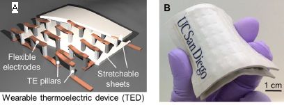
Look...

|
Part A, the photo at the left, shows the device on a person's arm. It is labeled TED = thermoelectric device. (The white square contains the actual device. The blue is armband.)
Part B (right) shows some results. The frames of Part B are for six different starting temperatures -- the air temperature (Tair). Each frame shows temperature vs time. Let's look at the first one in detail. The black line near the bottom is labeled Tair. For the first frame, it was set to 22 °C -- and held constant. The colored curve is Tskin. In this case, it started at about 28 °C for the first few minutes; that reflects the natural response of the person to the air T. Then, at about 5 minutes, TED was turned ON. Tskin rose, quite rapidly, to 32 °C. 32 °C was chosen here as the desired T, or "set point" for the device. The top of the frame is labeled TED OFF and TED ON. The arrows refer to the two sides of the graph, unshaded to the left and shaded to the right, respectively. The six frames differ in Tair; it ranges from 22 °C to 36 °C. In each case, after turning TED ON, Tskin quickly became 32 °C. That required TED to heat the arm in the first three cases, and to cool the arm in the last three. This is part of Figure 5 from the article. |
That is, the TED was able to rapidly provide the desired T given air temperatures over a range of 14 Celsius degrees, heating or cooling as needed. (Without the device, the person could maintain the desired T over only about a 2 degree range.)
So what is this little device? What does thermoelectric (TE) mean?
As the name might imply, a TE device involves heat and electricity. In the device shown above, an electric current is used to pump heat from one side to the other. Switch the direction of the current, and you switch the direction of heat transfer. That's from the skin or to the skin, in this case. The TE (or "Peltier") effect is well known to physicists, but probably unfamiliar to many people; it takes advantage of an unusual combination of properties in some materials, and is otherwise not easy to explain.
The principle of TE devices is fine; making them practical is another matter. The technical progress in the current work was the internal design of the TED, so that the heat was efficiently removed to the outside world. (The device contains no "heat sink".) Imporantly, the device was made to be flexible, as needed if it is to effectively become an article of clothing.
|
Part A (left) shows a diagram of the device. You can see its open and flexible structure.
Part B (right) shows a photograph of the device. It is about 5 cm on a side, and less than 1 cm thick. See scale bar. |
|
This is part of Figure 1 from the article. The left side, which I labeled "A" here, is actually one part of Figure 1A in the article. | |
The results in the top figure show cooling of 4 C°. Other work shows that the device can provide 10 degrees cooling. Of course, the power required increases for the bigger effect.
The TE is fundamentally simple, and well-suited to small devices. In general, TEDs are long-lived; after all, they have no moving parts. Time will tell whether the implementation here is robust. Battery lifetime is an issue, and will depend on how much skin you want to affect, as well as on the T change. Of course, if you are inside, you could plug it in; as we noted at the outset, air conditioning yourself rather than the whole room is a motivation for the work.
News stories:
* Researchers Develop Wearable Cooling and Heating Patch. (Sci.News, May 20, 2019.)
* Wearable Patch Can Regulate Body Temperature. (E Montalbano, Design News, June 14, 2019. Now archived.)
The article, which is freely available: Wearable thermoelectrics for personalized thermoregulation. (S Hong et al, Science Advances 5:eaaw0536, May 17, 2019.) The Introduction section provides a nice overview of how "personalized thermoregulation" may be useful, and summarizes previous efforts to achieve it.
The Wikipedia page on "Thermoelectric cooling" seems useful. It includes good discussions of the pro and con of TE. However, don't expect it to lead to good understanding of how it works.
* * * * *
More about flexible electronics: Supercapacitors in the form of stretchable fibers -- suitable for clothing (May 2, 2014).
More things you might wear...
* An ultrasound device you can wear (September 17, 2022).
* Brain imaging, with minimal restraint (June 2, 2018). Check the picture.
* Using your sunglasses to generate electricity (August 14, 2017).A different application of thermoelectrics... A step toward a practical thermoelectric converter: get the oxide out (October 11, 2021).
Also see: Using ultrasound to recharge an implanted medical device (October 19, 2019).
There is more about energy issues on my page Internet Resources for Organic and Biochemistry under Energy resources. It includes a list of some related Musings posts.
August 17, 2019
A recent article claims that people have more fabellae now than they used to -- a hundred years ago.
Here is the data summary from the article...
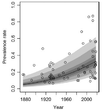
|
The graph shows the prevalence of fabellae in people over time, for about the last century.
Prevalence is shown (y-axis) as the fraction of knees with a fabella. Each point on the graph is for one reported set of measurements in the scientific literature. The dark line shows a best-fit; the shaded regions show the confidence intervals, at various levels of confidence. There are two main observations: - The prevalence of fabellae seems to be increasing over time. - At any particular time, reports of fabella prevalence vary widely. This is Figure 4 from the article. |
So. what are fabellae? Here are pictures of some human knee joints, each of which has a fabella. It may help you to know that the word fabella means "little bean".
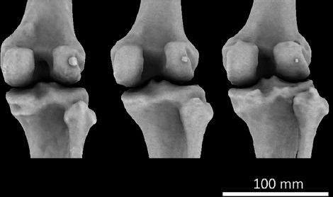
|
Each picture is for the right knee of an adult human female.
Each knee here has a fabella. (You did find the "little bean"?) The article identifies these fabellae as large, medium, small (left to right). That is, the range of sizes shown here is intended to be instructive. This is Figure 1 from the article. |
That's the "what". You probably have more questions. In general, the answer is, we don't know. It's that kind of topic.
There are methodological questions, especially about the older reports. The authors report that the prevalence rates of other, similar (sesamoid) bones have not increased over the same time period; that provides something of an internal control suggesting that the trend is real. In any case, the high variability of the numbers in the modern reports would seem to stand.
One more fact that is particularly interesting... An individual may have 0, 1 or 2 fabellae. That is, development of fabellae on the two knees of a person seems to be (at least partially) independent.
What causes the variation -- over time and between knees? There may well be genetic underpinnings, but the rapid changes in fabella prevalence reported here cannot be due to genetic changes. That implies environmental influence. What? The authors suggest it may be due to people getting bigger, thus altering the forces in the developing joint system. That's just speculation, but is an example of something that can be studied further.
The fabella seems to have come and gone before during the evolutionary history of primates.
An odd little article, about an odd topic. It involves interesting methodological issues, and it focuses us on an aspect of human variation that is probably unfamiliar. Does it matter? There is some evidence linking the presence of fabellae to knee problems, including arthritis. Not a strong case, but a clue to follow.
News stories:
* Tiny Knee Bone, Once Lost in Humans, Is Making a Comeback -- The fabella disappeared from our lineage millions of years ago, but over the last century, its presence in people's knees has become more common. (J Akst, The Scientist, April 19, 2019.) Now archived.
* Mystery arthritis-linked knee bone three times more common than 100 years ago. (C Brogan, Imperial College London, April 17, 2019.) From the university.
The article, which is freely available: Fabella prevalence rate increases over 150 years, and rates of other sesamoid bones remain constant: a systematic review. (M A Berthaume et al, Journal of Anatomy 235:67, July 2019.)
Among the questions about the fabella... what is the proper plural? Amusingly, the authors use both -e and -s within this article. The Wikipedia page avoids the point, though making clear that the term comes from Latin.
The term sesamoid bones is used here. It refers to bones in tendons and muscles. The term comes from their common size; think "sesame seed".* * * * *
Posts about knees include...
* Can we predict whether a person will respond to a placebo by looking at the brain? (February 21, 2017).
* Using your nose to fix knee damage (January 28, 2017).
August 14, 2019
Two related items, about brain-computer interfaces (BCI). The first is a report from Elon Musk's new company in the field. The second is a brief overview of the challenges in the field. Thanks to Borislav for sending the first item; the second showed up in looking for information about the first.
1. Elon Musk -- and the brain-computer interface. A new Musk company, called Neuralink, made a big splash recently by announcing some progress... They have developed miniaturized brain-implantation devices with ten times more electrodes than those used previously, and a robotic surgical technique for inserting them.
* News story: Elon Musk's Neuralink Says It's Ready for Brain Surgery. (A Vance, Bloomberg, July 16, 2019. Now archived.)
* The article, which is freely available: An integrated brain-machine interface platform with thousands of channels. (Elon Musk & Neuralink, July 16, 2019.) It is posted at a preprint server. There is no indication that any peer review or further publication is planned. The article is described as a white paper. There is nothing wrong with this; it's just that you should realize that the work has not been given any external review. Other materials you will find should generally be taken as promotional.
Update December 16, 2021... The article has been published; it is labeled "white paper". Here is a direct link to the published article...
* The article, which is open access: An Integrated Brain-Machine Interface Platform With Thousands of Channels. (Elon Musk, Journal of Medical Internet Research 21:e16194, October 31, 2019.) Links to some comments (see first page).
* and one more news story: Neuralink's Technology Is Impressive. Is It Ethical? -- Elon Musk's audacious vision of a smartphone-controlled brain-machine interface comes with potential risks. (Andrew Maynard, Medium, July 23, 2019.)
2. The BCI challenge. A brief but interesting "opinion" article about the field came out in late 2018. It emphasizes the emerging role of tech entrepreneurs. It mentions Neuralink, but without specifics.
* The article, which is freely available: Silicon Valley new focus on brain computer interface: hype or hope for new applications? (S Mitrasinovic et al, F1000Research 7:1327, First published: August 21, 2018.) It is posted with reports by three reviewers (in a process sometimes called open review).
* Recent BCI post: Using a brain-computer interface to direct synthetic speech (July 16, 2019).
* More about brains is on my page Biotechnology in the News (BITN) -- Other topics under Brain. There is a list of related Musings posts.
August 13, 2019
A recent article makes a connection between two lines of work on Alzheimer's disease (AD). One is the common story of a small peptide called amyloid-beta (Aβ or AB). Aβ is a fragment cleaved off a larger normal protein. Aggregated forms of Aβ are suspected to be an important part of the disease process. However, attempts at therapy based on this model have, so far, failed. The second line of AD work here is one we usually hear less about, though it has been noted for decades: people with AD have reduced blood flow to the brain, a vascular deficiency.
The new article provides evidence that the Aβ peptide causes vascular deficiency.
The first figure shows the idea, based on lab testing...
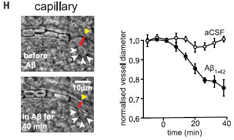
|
In this test, human brain slices were examined in the lab.
In the photos at the left, there is a capillary running horizontally across the figure. Look at the red bars near the right end of each capillary. Each red bar marks the diameter of the capillary at that site. The top red bar is clearly longer than the bottom red bar. What's the difference? Aβ peptide was applied to the lower sample at that site. That is, Aβ peptide caused the capillary to constrict. The graph at the right shows the effect over many measurements. The graph shows the diameter of capillaries over time. (It's a normalized diameter, with the initial size of each capillary set to 1.) The top, control, curve (open symbols), shows that the diameter remains more or less constant over time. The bottom curve (dark symbols) shows the result when Aβ is added at time zero. You can see that application of the Aβ peptide causes the capillary diameter to decline over the 40 minute observation period. On the graph, the label says Aβ1-42. That means that the specific form of Aβ peptide used here has amino acids 1-42 of the original protein. There are various forms of Aβ, but this is a common one. aCSF = artificial cerebrospinal fluid. This is Figure 1H from the article. |
The experiment above shows that Aβ can constrict capillaries -- in the lab. It doesn't say it happens in nature or is relevant to the disease process.
Here's some data from people...
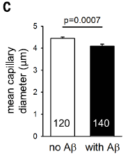
|
In this test, brain samples obtained during surgery were examined to see whether or not they contained Aβ deposits. Capillaries from the brain samples from both groups were measured.
The graph shows the result of measuring the diameters of about 5000 capillaries from the brains of people with Aβ deposits, along with a similar control set (no Aβ deposits). |
|
The graph shows that the capillaries of people with Aβ deposits are narrower than for the control group. It's not a big effect, but, hey, this is the blood supply to the brain. And the effect certainly is statistically significant. The number that is so prominent near the bottom of each bar? It's the number of images examined. Ignore it. This is Figure 4C from the article. | |
It's a long complex article; we have offered only hints of its argument here. Importantly, the scientists work out how Aβ constricts capillaries.
In brief... The presence of Aβ leads to the production of reactive oxygen species (ROS). The ROS set off a chain of events that leads to an effect on cells around the capillaries called pericytes, causing them to contract. In fact, the capillary measurements reported above were made at the site of pericytes.
If this finding holds up, how does it affect our understanding of AD? That remains to be seen. However, our current understanding has not been sufficient to lead to a treatment, so a better understanding should be welcome progress.
As an example of how things might go... Perhaps the effect of Aβ on capillaries is one of its most important effects. If so, treatments targeted at capillary constriction might be useful. Such treatment might not directly deal with Aβ at all, instead focusing on one of its targets. But for now that is speculation. What's important is that the article connects Aβ and vascular effects, and seems to open up some new lines of work for exploration.
It is easy to get confused or overwhelmed when reading about AD. One aspect of the work is to describe what happens, and why. Another aspect is to try to sort through the things that happen and figure out which ones are most important in the disease process. It is not easy to make that distinction, and the AD field is full of effects of unknown importance.
News stories:
* Squeezing of blood vessels may contribute to cognitive decline in Alzheimer's. (Neuroscience News (University College London), June 23, 2019.)
* Aβ Acts Through Pericytes to Throttle Brain Blood Flow. (M B Rogers, ALZFORUM, June 22, 2019.) Includes some comments from scientists in the field at the end.
* News story accompanying the article: Neurodegeneration: The vascular side of Alzheimer's disease -- Protein aggregates restrict cerebral blood flow, which causes neural injury. (A Liesz, Science 365:223, July 19, 2019.)
* The article: Amyloid β oligomers constrict human capillaries in Alzheimer's disease via signaling to pericytes. (R Nortley et al, Science 365:eaav9518, July 19, 2019. Online only; not in print edition, except for a one-page summary, p 250.)
Previous post on AD: Formation of new neurons in adults: relevance to Alzheimer's disease? (May 21, 2019)
Next: Alzheimer's disease: a role for inflammation? (January 18, 2020).
My page for Biotechnology in the News (BITN) -- Other topics includes a section on Alzheimer's disease. It includes a list of related Musings posts.
August 11, 2019
The "Paleolithic" ("paleo") diet is an odd one. The idea behind it is that we should eat what ancient man ate; that was, perhaps, the natural diet for humans. In particular, the paleo diet avoids the products of modern agriculture. There are numerous difficulties with that idea. We don't know it was good for them. And we certainly don't know that it is good for us, in the quite different circumstances of modern man. (For example, infectious disease is a much smaller burden -- and selective force -- now than for ancient man.) Of course, all ideas are welcome. Why don't we test them?
Testing human diets is not an easy task. Not surprisingly, not much good testing gets done. However, a new article reports a test of the paleo diet. It's a limited test, but it offers some interesting results.
Here are some of the data. I have selected a few items, from various places in the article, to present here, because they are part of one story -- the major story that the authors develop.
| Control diet | Strict paleo diet | Significant?? | |
|---|---|---|---|
| Food intake (from Table 2) | |||
| Whole grains (servings/day) | 2.9 | 0.1 | ** |
| Red meat (servings/day) | 0.4 | 0.8 | NS (but probably close) |
| Clinical measurements (from Table 3) | |||
| TMAO (µM, blood serum) | 3.9 | 9.5 | ** |
| Gut bacteria (from Figure 3) | |||
| Hungatella (relative abundance) | 0.01 | 0.02 | ** |
There were about 20 people in the strict paleo group; they had a long commitment to that diet, but the study followed them here for only a few days.
For significance, ** means p ≤ 0.01 for difference from control group (a common convention). * would mean p ≤ 0.05. NS means p > 0.05.
"Serving" is defined for each type of food in the article. All that matters here is that it is consistent across a row.
Numbers shown for the bacteria are my estimates from the graph.
What's this about? The player of interest is TMAO (trimethylamine-N-oxide). We have noted it before; it has been linked to consumption of red meat -- and to heart disease [link at the end].
The key finding, then, is that TMAO is elevated in people on the strict paleo diet. Not good, given the link to heart disease. (Note that the current study is short term, and has no direct measure of heart disease.)
Are there clues as to why people on the paleo diet have elevated levels of TMAO? Yes, three of them, shown in the table above.
One is presence of Hungatella bacteria in the gut. That may not be a familiar name, but it has been established that it makes TMAO. High levels of Hungatella bacteria in the gut correlate with high levels of TMAO in the blood, and we understand why.
Hungatella is a strict anaerobe, formerly classified as Clostridium.
And there are two clues in the diets. The people on the paleo diet eat more red meat and less whole grains; those two dietary points correlate with having high TMAO.
The red meat effect does not test as significant; see the table. Nevertheless, there is a correlation here. (The lack of significance is due, in part, to the high variability of meat consumption in both groups.) We note the red meat effect, despite the lack of statistical significance here, to make the connection to the earlier Musings post.
It is a plausible hypothesis from this work that the grains serve to reduce the amount of Hungatella bacteria in the gut. The red meat provides the substrate for making TMAO; the Hungatella convert that substrate to TMAO; the dietary grains reduce the Hungatella. (More specifically, the authors attribute the "grains" effect to "resistant starch".)
The trial here is too small (and not fully controlled) to be convincing. But it seems to provide interesting leads to guide further work.
There is a third test group in the study. This group, termed pseudo-paleo, followed a loose version of the paleo diet. The results for that group are partly consistent with what is discussed above, but frankly are a little confusing. Let's attribute that, at least in part for now, to the small study size.
News stories:
* Paleo diet linked linked [sic] to greater odds of heart disease. (A Slachta (Cardiovascular Business), July 24, 2019.)
* Heart disease biomarker linked to paleo diet. (Science Daily (Edith Cowan University), July 22, 2019.)
The article, which is freely available: Long.term Paleolithic diet is associated with lower resistant starch intake, different gut microbiota composition and increased serum TMAO concentrations. (A Genoni et al, European Journal of Nutrition 59:1845, August 2020.)
Background post on TMAO: Red meat and heart disease: carnitine, your gut bacteria, and TMAO (May 21, 2013).
A post about low-carb diets in general: Low-carb diets: Long-term effects? (September 4, 2018). To help you compare current and earlier posts... The strict-paleo group in the current study consumed carb for about 17% of their energy intake (Table 2); that is an extremely low value.
A recent post about a human diet: How a "low-gluten" diet may benefit those who are not gluten-sensitive (January 27, 2019).
More... Does eating vegetables reduce the risk of cardiovascular disease? (February 28, 2022).
My page Internet resources: Biology - Miscellaneous contains a section on Nutrition; Food safety. It includes a list of related Musings posts.
August 9, 2019
A team of scientists set out to make a new type of glass -- one that would not shatter upon impact.
The results are clear...
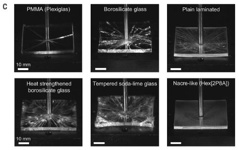
|
In this test, six pieces of glass, or glass-like materials, were tested for impact resistance.
One survived in good condition. That's the "nacre-like" material at the lower right. The pieces were 5 x 5 x 0.3 cm. This is Figure 4C from the article. |
What did the scientists do? And what's nacre? Nacre (mother-of-pearl) is part of mollusk shells (e.g., clamshells). It is the material responsible for their strength. The basis of the strength of nacre is, in part, its multi-layered brick-like structure. The small pieces ("bricks" or "tablets") can move independently. Impact forces are dissipated by "brick" movement rather than breakage.
The nacre-like glass is like that, with alternating layers of glass bricks and plastic. Of course, there is a lot of detail to "get it right". The major technical development is a process for making large sheets of tiny glass "bricks". (The brick size is about 1 millimeter.) In brief... They start with a regular glass sheet. They then engrave lines between bricks (using a laser beam); the sheet is intact but weakened at the lines between the bricks. The process of attaching the plastic layer weakens the engraved lines further, resulting in free brick pieces.
Unbreakable? No, but they say it is 2-3 times more resistant to impact than the best current glasses.
There is a trade-off. The tablet structure makes the glass less able to support weight; it bends more easily. Balancing out the pro and con features will be for future work.
News stories:
* New type of glass inspired by nature is more resistant to impacts. (Phys.org (C Q Choi, Inside Science, American Institute of Physics), June 28, 2019.) Good figures, showing the design concept.
* Seashells inspire shatterproof glass. (B Dumé, Physics World, July 2, 2019.)
* News story accompanying the article: Materials science: Bioinspired improvement of laminated glass -- Laminated glass with a microstructure inspired by nacre has a higher impact resistance. (K C Datsiou, Science 364:1232, June 28, 2019.)
* The article: Impact-resistant nacre-like transparent materials. (Z Yin et al, Science 364:1260, June 28, 2019.)
A post about a multi-layered mollusk skeleton: Armor (February 5, 2010).
Among many posts about glass...
* How to mold glass (June 19, 2021).
* Libyan desert glass, King Tut, and the hazards of meteorite strikes (May 31, 2019).
* A new record: spinning speed (October 12, 2018).
* Why bats fly into windows (December 3, 2017).
* Turning metal into glass (September 21, 2014).For more about bio-inspiration, see my Biotechnology in the News (BITN) topic Bio-inspiration (biomimetics). It includes a listing of Musings posts in the area, and has additional information.
August 7, 2019
Drug metabolism by your microbiota. A recent post was about how the gut microbiota affects treatment of Parkinson's disease by metabolizing a common drug. Looking for information on the article led me to a current news feature in The Scientist broadly on the metabolism of drugs by the gut microbiota. It's largely on cancer drugs, but includes the new Parkinson's article. This is an emerging field, and there is considerable confusion, as the current item notes. The microbiome effect is undoubtedly important, but our understanding is still quite incomplete.
* News feature: How the Microbiome Influences Drug Action -- Through their effects on metabolism and immunity, bacteria in the gut affect whether medications will be effective for a given patient. (S Williams, The Scientist, July 15, 2019. In print: July issue, p 38.) Now archived.
* Background post: Metabolism of the Parkinson's disease drug L-DOPA by the gut microbiota (July 26, 2019).
August 6, 2019
Pieces of the Earth move around. Sometimes, strain builds up. Sometimes, the strain is released suddenly -- in an earthquake. That's the general idea, but the details are unclear, and there has been no good model system for studying quakes in the lab.
A new article reports the development of such a system. It involves a layer of disks between two concentric cylindrical shells. There is a weight on top, and the bottom edge of the layer is driven to rotate. Sensors measure force -- and sound. That the system rotates allows it to run for extended periods. In a routine 24-hour test, it can generate a million labquakes.
It may be good to check out the video at this point. It is included with the news story listed below. It shows the apparatus -- in action. The color changes represent changes in the forces; the optical properties of the disk material vary with force.
The video may not be clear, but at least it will give you an idea. In fact, the nature of the apparatus is not very clear, even after reading the details in the Supplemental Material. We'll come back to the apparatus later. For now, what matters is the concept: a shear strain in a rotating device.
The following figure illustrates the data from the force sensors...
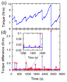
|
The graphs show the torque (circular force) over time, for one hour (3600 seconds) of operation. The torque being measured is at the top of the rotating layer of disks, against the cover of the apparatus.
Part c (top) shows the raw data. The torque varies, in an irregular manner. Much of the time, the torque increases; this is due to the strain in the system building up. (The device is being driven at constant speed. If it weren't for that layer of disks gumming up the system, the torque would be constant.) From time to time, the torque drops -- abruptly. That's a quake event. Something happened in the material, in that layer of disks, to relieve the strain that had built up. |
|
Part d (bottom) shows the same data plotted a little differently, to make the drops clearer. In this graph, they plot the "torque difference" -- but only during drops. That is, each quake event -- a drop in torque -- is now a "blip" (a vertical blue line). And each such event is marked with an x. You can see that there are many blips and x's. Several stand out clearly; for some, you can make the connection between a drop in part c and a blip in part d. There are also a lot of x's that are very close to the zero line. The inset graph shows an enlargement of one such region. Smaller quakes are now apparent. It's also clear that there are many more of the very small events than the big ones that are so clear. This is part of Figure 1 from the article. | |
So the device generates irregular releases of strain within the material. And most of those releases are small events. Earthquakes are like that.
The authors go on to analyze the data quantitatively. Here is one of those analyses...
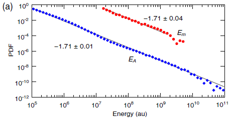
|
The graph shows the frequency distribution (y-axis) of quakes of different energies (x-axis). PDF = probability density function. The energy scale is in arbitrary units (au). Both scales are logarithmic.
There are two sets of data. One is for quakes detected by the force sensors (red data; upper). The other is for quakes detected by the acoustic sensors (blue data; lower). The latter can detect a much wider range of quakes, including very low-energy events. Main finding... both curves have the same slope: -1.7. That's the slope seen for such curves for earthquakes -- the Gutenberg-Richter law. The law says that small quakes are more frequent than big ones. Since the graph is log-log, the slope is the exponent in the relationship. This is Figure 2a from the article. |
The graph above shows that the labquake device generates events that follow one of the important laws of earthquakes.
The authors go on to test two more quantitative relationships found with earthquakes. In both cases, their experimental system is in good agreement with what is found for natural quakes. Good quantitative agreement. The agreement suggests that the system deserves further study as a lab model for earthquakes.
We've noted that it is hard to describe the apparatus. We've also noted that one can follow the concept without understanding the apparatus. The following statement, from the article Supplement, may be useful... Although our apparatus is composed of two plates that compress and shear a granular material, it is important to point out that this system replicates the dynamics of a tectonic fault, but not the fault itself. Our grains do not necessarily represent the granular material inside a real fault. Our granular system provides, thanks to the force network, a very heterogeneous and evolving matrix to store the mechanical energy generated by the relative movement of the plates. This emerging and evolving heterogeneity in terms of energy thresholds is the key ingredient of our system, and it is responsible for a distribution of events that resembles the Gutenberg-Richter law. The quotation is from the start of Section III of the Supplement, Insights into real earthquakes. It is complete except for removing references.That is, the scientists do not suggest that the events they create and observe are just like little earthquakes, but only that they behave like them statistically.
News story: Focus: Collection of Disks Mimics Earthquakes. (M Schirber, Physics 12:62, May 31, 2019.) Excellent overview of the work. The main figure gives you an idea of the layer of disks, though without context in the device. It is similar to the inset of Figure 1b from the article, but much clearer.
A short video is included in that news story (12 seconds; no sound). It shows the device in operation. A somewhat longer version (30 seconds) is posted with the article at the journal web site, below; that version requires subscription access. It seems to be just like the short video included with the news story -- just longer.
The article: Continuously Sheared Granular Matter Reproduces in Detail Seismicity Laws. (S Lherminier et al, Physical Review Letters 122:218501, May 31, 2019.)
A recent post about earthquakes: Another million earthquakes for California (June 30, 2019).
August 3, 2019
One type of fatty acid is known as ω-3 (ω = omega). This type of fatty acid is characterized by having a carbon-carbon double bond three positions in from the "far end". Musings has described this in an earlier post [link at the end]. As noted there, some people take ω-3 fatty acids, in the form of fish oil, as a food supplement.
A recent article looks at the importance of ω-3 fatty acids to the fish. Stickleback fish.
The little stickleback fish fascinates biologists. There are many populations of them around the world -- distinct strains, or even distinct species. How did so many species arise? Extensive study of the biology of the sticklebacks has led to the idea that the marine (ocean) form is the ancestral form, and then numerous species developed from this in various freshwater environments.
The first figure examines two marine stickleback species found near Japan...
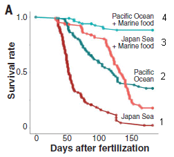
|
In this test, the survival of two strains of fish was tested with two feeding conditions.
The two strains of fish are called Japan Sea and Pacific Ocean, referring to the source. The baseline feeding condition was with a diet known to be low in ω-3 fatty acids. The second condition was that base diet supplemented with "marine food". |
|
There are two main observations: - The fish strains differ. On the base diet, Pacific Ocean fish survived better than did the Japan Sea fish (compare curves 1 and 2). That is, the Pacific Ocean fish had a longer lifespan. - The diet supplemented with "marine food" improved the survival for both fish strains (curves 1 vs 3 and 2 vs 4). This is slightly modified from Figure 2A from the article. I have added numbers for the curves, at the far right. | |
The "marine food" is known to be a good source of ω-3 fatty acids, thus remedying the deficiency of the base diet. As the article develops, various lines of evidence point to the ω-3 fatty acids as being the key underlying variable. In particular, the genetic work focused on a key gene for making them: Fads2. (Fads = fatty acid desaturase, the enzyme that puts in the double bond.)
The following graph shows the results for one experiment on the role of the Fads2 gene...
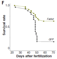
|
In this test, the Japan Sea strain was modified by adding an additional copy of the Fads2 gene. As a control, another gene (GFP) was added to another batch of fish.
Adding the Fads2 gene improved the survival of the fish. (The control curve here, with the GFP gene, is similar to the control curve (#1) for the same strain in the top experiment.) This is Figure 2F from the article. |
What really interested the scientists was the evolution of strains that could thrive in fresh water. The purpose of the work summarized in the following graph was to look at the number of copies of the key gene Fads2, introduced above, in marine and freshwater stickleback strains.
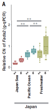
|
The y-axis shows the number of copies of the Fads2 gene. (Actually, the relative number, but we need not worry about that.)
Results are shown for three strains (or groups) -- and separately for males and females. Two of the three strains shown here are those shown above. The third (right-hand) data set is for a group of freshwater strains from the same general area. Observations: - Females have more copies of the Fads2 gene than do males. (The main copy of the gene is on the X chromosome.) Focusing on the females is useful. - The freshwater fish have the highest copy number for this gene. - The Pacific Ocean strain has more copies of the gene than does the Japan Sea strain. This probably accounts for the difference seen in the first figure above. This is part of Figure 4A from the article. The rest of Figure 4A shows similar results for fish from other regions. In each case, the freshwater strains have more copies of the gene. |
Those results show that freshwater fish have more copies of the gene for making ω-3 fatty acids than do the marine strains. Comparison of similar sets of stickleback strains from other regions gave that same general result.
In fact, analysis of a broader range of fish beyond sticklebacks suggested that the effect holds across fish in general. Since the underlying problem is a nutritional deficiency associated with fresh water, that is reasonable.
Overall, the work shows the importance of ω-3 fatty acids to fish. In particular, it suggests that mutations leading to increased synthesis of ω-3 fatty acids were one important step in the development of fish that can thrive in freshwater.
News stories:
* Freshwater find: Genetic advantage allows some marine fish to colonize freshwater habitats. (Phys.org (Research Organization of Information and Systems), May 30, 2019.)
* "Copying & pasting" a gene allows stickleback to live in freshwater habitats. (University of Bern, June 3, 2019.)
* News story accompanying the article: Evolutionary biology: Jumping gene gave fish a freshwater start -- Fish diversification depended on multiple copies of a metabolic gene. (J N Weber & W Tong, Science 364:831, May 31, 2019.)
* The article: A key metabolic gene for recurrent freshwater colonization and radiation in fishes. (A Ishikawa et al, Science 364:886, May 31, 2019.)
A background post on ω-3 fatty acids: Omega-3 fatty acids; fish oil (March 29, 2010).
More... Vitamin D, omega-3 fatty acids, and autoimmune disease? (March 29, 2022).
A recent post about fish genes: Fish may adapt to pollution by stealing genes from another species (July 21, 2019). In contrast to how genes changed in that earlier work... In the current work, the number of copies of the Fads2 gene probably changed due to transposon action.
For more about lipids, see the section of my page Organic/Biochemistry Internet resources on Lipids. It includes a list of related Musings posts.
July 31, 2019
Cow genetics and methane emissions? Cows -- or, rather, the microbes in cow stomachs -- generate methane, making a significant contribution to greenhouse gases. Cows vary, but there has been no practical way to control methane emissions. A team of scientists has now analyzed the genomes and microbiomes of diverse dairy cows. They have found cow genes that correlate with microbiome composition, and thus with methane emission. This opens the prospect of breeding low-emission cows. There is no certainty that such breeding will be successful and without side effects, but it is an interesting lead. (Some of their data suggests that reduced methane emission may be associated with higher milk production. That's reasonable, since methane emission is a waste of energy.)
* News story: Potential for reduced methane from cows. (Science Daily (University of Adelaide), July 8, 2019.) Links to the article, which is freely available.
July 30, 2019
Circadian rhythm: the natural variation of biological activity through the daily cycle. Humans sleep and wake up even in the absence of clocks, and they do so on a rather regular basis.
What is the basis of our circadian rhythm? Part of the story is that, as darkness comes, our level of the hormone melatonin rises. That promotes sleep.
That must make us wonder... How does artificial lighting, common only in the last two centuries, affect our sleep?
A recent article provides more evidence on the matter. In particular, it provides evidence for huge variation between individuals in how they respond to the artificial light of the modern human evening.
Look...

|
The main graph shows how numerous individuals respond to light in the evening, shortly before bedtime.
The response measured is suppression of melatonin, as a percentage (y-axis). That is plotted against the light intensity (x-axis; log scale). Each curve, regardless of color, is for one person. The main finding is that these curves vary -- a lot. The blue-curve person has 50% suppression at less than 10 lux; that is high sensitivity to light. The red-curve person has 50% suppression only well above 100 lux; that is high sensitivity. That is, the range of sensitivities to light, as judged by melatonin suppression, is more than 10-fold (actually, about 50-fold). The three graphs at the right show the effect another way. They show the actual melatonin levels for the two individuals whose data are shown in color. The three graphs are for low, medium, and high light intensities (top to bottom). Each curve shows the melatonin level in the individual vs time, from about 4 hours before bedtime to an hour after bedtime. For the lowest light level (top graph), both the red and blue curves rise about the same: melatonin levels start to rise about 2 hours before bedtime. For the highest light level (bottom), the red curve is about the same, but the blue curve shows very little melatonin. That is, the light-sensitive person has had their natural preparation for sleep completely disrupted. The label on the top graph says 0.1 lux. That is probably supposed to be 1 lux. Doesn't really matter for us. This is Figure 2 from the article. |
Common room lighting is often in that range of 10-100 lux. (The authors suggest that the average lighting is about 30 lux.) That is, the range shown above is relevant. Some people, such as the blue-curve person above, can easily have their natural sleep cycle disrupted by such evening lighting. But people vary a lot, and some would be unaffected. That's the big message here: people vary in how common evening lighting affects their natural preparation for sleep.
News stories:
* Sensitivity of human circadian system to evening light. (EurekAlert! (PNAS), May 27, 2019.) Brief, but to the point.
* Light the night? Monash research finds that some of us are hypersensitive to evening illumination. (Monash University, June 3, 2019.)
The article, which is freely available: High sensitivity and interindividual variability in the response of the human circadian system to evening light. (A J K Phillips et al, PNAS 116:12019, June 11, 2019.)
Other posts about sleep cycles, melatonin, and such include:
* Conversing with dreamers (July 6, 2021).
* The genetics of being a "morning person"? (April 15, 2016).
* Does it matter what time of day you milk the cow? (December 28, 2015).
* How caffeine interferes with sleep (December 11, 2015).
* Melatonin and circadian rhythms -- in ocean plankton (November 24, 2014).My page of Introductory Chemistry Internet resources has a section on Lighting: halogen lamps, etc. It includes a list of related Musings posts.
July 29, 2019
A team of engineers in the United States and India has recently shown that the leaves of wheat plants can sneeze. The engineers suggest that wheat sneezing could transmit disease.
The first figure shows the idea...

|
In this cartoon, the big green thing is a wheat leaf. The blue things are water droplets, and the smaller brown things are fungal spores.
A key fact is that wheat leaves are extremely hydrophobic -- or "superhydrophobic". As a result, nearby water droplets are likely to come together and coalesce into one droplet. The coalescence of drops releases energy -- enough to propel the droplets into the air. |
|
If there are spores on the leaf, they may attach to a droplet, and thus be expelled from the leaf surface. Expelled far enough that they could be carried away by even a gentle wind. This is Figure 1a from the article. | |
The article provides both theory and experimental evidence for parts of the story. The following two figures show some of the evidence...
|
This figure shows an example of a wheat-leaf sneeze.
It shows superimposed images from time-lapse photography over about 30 milliseconds. A water droplet was formed at the lower left by coalescence; it rose (propelled by the energy released during droplet coalescence), and then fell. At the peak, it was about a millimeter above the surface (assuming the scale bar applies for height). That's about high enough that the droplet could be blown away by a wind. This is Figure 3a from the article. |
The sneeze above is from an uninfected leaf. Sneezing itself has nothing to do with infection. It follows simply from having small water droplets on the superhydrophobic surface. In nature, that would commonly be dew droplets, formed during the daily cycle.
Video. There is a video posted with the article. (Five minutes, no sound, some labeling.) It consists of a series of droplet-jump sequences. Some are clear, some not. I suggest you go through it once, and emphasize seeing some jumps. You can go back for more if you want. The video is posted at the journal web site, under Supplemental Material. Or: direct link to video. (The video is freely available, regardless of your subscription status for the journal.)

|
This figure shows that spores can be lifted off the leaf surface.
In this experiment, a piece of paper was carefully positioned at a defined height above the surface of the leaf -- a leaf with fungal spores on it. Droplets that were expelled from the surface rose and hit the paper. After some time, the spores that had attached to the paper were counted. The three sets of data are for three different leaves. For each leaf, data is shown for collecting spores at three different heights, from 1.5 to 5 millimeters above the surface. The observation is that all papers, at all heights tested, collected spores. The differences between the bars is not of particular interest for now. This is Figure 5c from the article. |
That figure provides evidence for droplets rising off the wheat leaf surface and carrying fungal spores with them. The authors argue that spores rising even 1 mm above the leaf surface could be blown away by a wind. Thus it seems reasonable that coalescence of dew drops on the surface of an infected wheat leaf could transmit the pathogen to a site on another plant.
Just to be clear... The article does not actually show disease transmission from one plant to another. But it does lay out the pathway by which such transmission could occur. The pathway is supported by both theory and experiment, as far as it goes. The main thing missing is the final step: they never provided a "recipient" to receive the spores.
Overall, the article provides an unusual view of a major food crop -- an engineer's view. But it also reveals information that could be useful in controlling a serious pathogen.
News stories:
* Dew drops spontaneously flinging themselves into the wind may spread wheat infections. (B Yirka, Phys.org, June 19, 2019.)
* Wheat Plants "Sneeze" and Spread Disease. (C Intagliata, Scientific American, June 25, 2019.) Podcast, with transcript.
The article: 'Sneezing' plants: pathogen transport via jumping-droplet condensation. (S Nath et al, Journal of the Royal Society Interface 16:20190243, June 5, 2019.)
More things superhydrophobic...
* An improved bandage, based on superhydrophobic carbon fibers (January 21, 2020).
* A superhydrophobic fly -- that can survive in highly alkaline water (February 25, 2018).
* Water droplets on a trampoline (April 9, 2016). There is some connection between the current work and this older work; both involve water droplets jumping from a superhydrophobic surface, though in different situations.Posts about wheat include...
* How a "low-gluten" diet may benefit those who are not gluten-sensitive (January 27, 2019).
* Wheat, rice, and Starbucks (August 3, 2018).More sneezing: Shark skin inspires design of a new material to reduce bacterial growth (March 13, 2015).
Also see:
* How water droplets damage hard surfaces (June 18, 2022).
* Speech droplets: Can you transmit an infection to someone by yelling "Stay healthy" at them? (June 14, 2020).Another post about rust, the type of fungus-caused plant disease studied in the current work: A sticky pesticide (June 21, 2019).
July 26, 2019
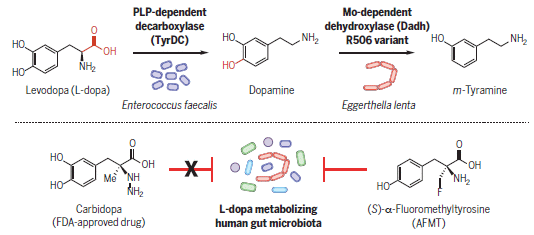
People with Parkinson's disease (PD) are deficient in the neurotransmitter dopamine. They may take the drug L-DOPA (Levodopa). The drug is taken orally; it is transported via the blood to the brain, where it is converted to dopamine.
However, L-DOPA may be converted to dopamine in the person's gut; that effectively renders it inactive, since the dopamine itself does not get transported to the brain. People vary in how much drug they lose at this step; it's a complication in the use of L-DOPA, one that is poorly understood.
A recent article reports progress in understanding the gut metabolism of L-DOPA. It also reports a new drug candidate that may improve the effectiveness and consistency of L-DOPA treatment.
The following figure is a useful summary of some of the key findings...
|
The top row of the figure shows the chemicals involved here and the bacteria that interconvert them in the gut.
The chemicals start with L-DOPA itself, at the left. The first step removes the carboxyl group (red; right-hand end of L-DOPA). That makes dopamine. The next step is to remove one of the hydroxyl groups (red; left-hand end of dopamine), to make a tyramine. The first step is done by Enterococcus faecalis; the second step is done by Eggerthella lenta. Identifying these bacteria that metabolize the drug was the first main finding of the current work. We'll come back to the second row of the figure later. L-DOPA is closely related to two of the standard amino acids. Remove one -OH group on the ring (the upper one), and you get tyrosine. Remove both -OH groups, and you get phenylalanine. This is the summary figure for the article. |
Here is one of the experiments that helped to show that pathway of bacterial metabolism...
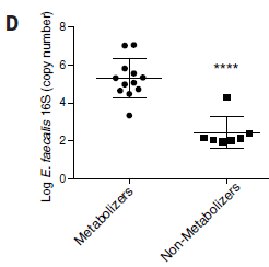
|
In this test, mixed microbial samples that did or did not metabolize L-DOPA were tested for the presence of E faecalis. The y-axis (log scale!) shows the level of this bacterial species, as judged by the amount of its characteristic 16S ribosomal RNA. Each point shows the level for one sample.
The points for metabolizers (on the left) are higher than the points for non-metabolizers (right). By about two logs -- or 100-fold. That is, the ability of a sample to decarboxylate L-DOPA correlates well with the presence of this bacterial species. The samples are fecal suspensions from different people. This is Figure 3D from the article. |
Is this information useful? Go back to the top figure, and look at the second row. It shows the action of two drugs that inhibit the first step in L-DOPA metabolism. One of them, carbidopa (left), is an approved drug. It's used to reduce the metabolism of L-DOPA, but it doesn't work very well. The current article tests it against the gut bacteria that inactivate the drug; it doesn't work. The red T in the figure indicates a potential blocking action; the x means it doesn't happen. On the other hand, the drug shown at the right (AFMT), which was uncovered in the current work, does inhibit L-DOPA breakdown by the gut bacteria.
That is, the human and bacterial enzymes for breaking down L-DOPA are sufficiently different that they respond to different inhibitors -- even though they carry out the same reaction. That explains why carbidopa doesn't work very well, and also offers a new drug candidate (AFMT), which should be tested further. If it works in real patients, it may offer a new tool in managing the effectiveness of L-DOPA treatment in PD.
The current article includes some testing of AFMT in mice, but not in humans.
News stories:
* Gut Bacteria Consume Parkinson's Drug Levodopa, Often with Harmful Side Effects. (Sci.News, June 27, 2019.)
* Human Gut Microbes Identified That Process Levodopa. (F Church, Journey with Parkinson's, July 1, 2019.) Stylistically somewhat odd, but this is a good presentation -- by a medical researcher who has PD.
* News story accompanying the article: Microbiology: Gut microbes metabolize Parkinson's disease drug -- A gut bacterial pathway that degrades the drug levodopa is identified and can be inhibited. (C O'Neill, Science 364:1030, June 14, 2019.)
* The article, which may be freely available: Discovery and inhibition of an interspecies gut bacterial pathway for Levodopa metabolism. (V Maini Rekdal et al, Science 364:eaau6323, June 14, 2019; not in print edition.) (Caution... In my copy of the pdf file, the first page is duplicated. Don't know if it will get fixed.)
Posts on PD...
* Could tomatoes be used as the source of a common drug for Parkinson's disease? (April 24, 2021).
* Does the appendix affect the development of Parkinson's disease? (December 11, 2018).
* Possible role of gut bacteria in Parkinson's disease? (March 17, 2017).More about dopamine: A connection: an endogenous retrovirus in the human genome and drug addiction? (October 29, 2018). Links to more.
More about human microbiomes...
* Can fecal transplantation be useful in treating cancer? (April 27, 2021).
* High-performing athletes: might they have performance-enhancing microbes in their gut? (June 28, 2019).More about brains is on my page Biotechnology in the News (BITN) -- Other topics under Brain. There is a list of related Musings posts.
July 24, 2019
Another resource shortage: sand.
* "Comment" article: Time is running out for sand -- Sand and gravel are being extracted faster than they can be replaced. Monitor and manage this resource globally... (M Bendixen, Nature, July 2, 2019. In print: Nature 571:29 (July 2, 2019).)
* Their reference 6 is the UN report: Sand and sustainability: Finding new solutions for environmental governance of global sand resources. United Nations Environment Programme (UNEP), 2019. Freely available: Sand report.
July 23, 2019
A recent article reports synthesizing a new material that could help you stay warm even in an Arctic winter.
Such work, of course, begins with an idea, an inspiration. It's shown in the following figure, at various magnifications...
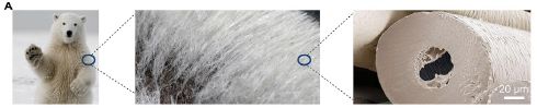
|
It may be hard to see, but there is a white scale bar at the lower right: 20 micrometers. This is Figure 1A from the article. |
Here is one important property of the new material, which is called carbon tube aerogel (CTA)...
|
The figure shows the thermal conductivity of a range of materials.
The new material has an extremely low thermal conductivity (red bar at the top). That is, it is an extremely good thermal insulator. This is Figure 4C from the article. |
The scientists measure various properties of the CTA. The general finding is that it is very good.
What is CTA? It's based on hollow fibers (tubes) of carbon -- inspired by the structure of the polar bear fur fibers shown in the top figure (at the right). Carbon itself has low thermal conductivity, and air is even better. CTA is highly branched, and quite flexible and resistant to fatigue. Being carbon-based, it repels water -- and its insulating ability is little affected by humidity. It is extremely light. And importantly, the scientists have a process for making this material which they think can be scaled up, though they have not yet done so.
Interestingly, the carbon for the tubes comes from sugar (glucose) in their process.
At the top, I suggested that the goal was to keep you warm in the Arctic. Actually, the goal here is not so much clothing as building material.
News stories:
* A polar-bear-inspired material for heat insulation. (EurekAlert! (Cell Press), June 6, 2019.)
* Bio-mimicry of polar bear fur offers insulation. (L Donaldson, Materials Today, June 27, 2019. Now archived.)
The article: Biomimetic Carbon Tube Aerogel Enables Super-Elasticity and Thermal Insulation. (H-J Zhan et al, Chem 5:1871, July 11, 2019.)
Among posts that deal with thermal insulation:
* Artificial wood (November 3, 2018).
* What if dung beetles wore boots? (December 14, 2012).More about polar bears:
* How polar bears keep their fur free of ice (April 16, 2025).
* A polar bear update (June 3, 2012).For more about bio-inspiration, see my Biotechnology in the News (BITN) topic Bio-inspiration (biomimetics). It includes a listing of Musings posts in the area, and has additional information.
July 21, 2019
Waterways near petrochemical plants often have high levels of pollution. That certainly applies to the Houston Ship Channel, an artificial waterway between the inland port city of Houston, Texas, and Galveston Bay in the Gulf of Mexico. It's oil country, and the Houston Ship Channel is lined with petrochemical plants -- as is obvious to anyone driving in the area.
A recent article reports some interesting analysis of one type of fish in the Channel, and how it has responded to one type of pollutant: halogenated aromatic hydrocarbons.
The fish the scientists study is the Gulf killifish (Fundulus grandis). The specific pollutant they use for lab work is a polychlorinated biphenyl PCB126.
Here are the results from one experiment...

|
In this experiment, fish were tested in the lab. The fish had been collected from waters with various levels of pollution. They were tested here to see how one particular pollutant affected the development of embryos.
The figure shows the effect of the PCB on various groups of fish. The effect is shown as the amount of cardiac deformity (y-axis) in the resulting embryos. The PCB concentration is shown on the x-axis. Look at the blue data (top, for the most part). For these fish, the cardiac deformity started very low, then rose dramatically as the PCB concentration increased. At the other extreme, the fish with black data (bottom) showed very little cardiac deformity even at the highest level of PCB tested. |
|
Now look at the "Pollution level" key above the graph. The blue is for fish from water with minimum pollution (out in the Bay); the black is for fish from the most polluted water (very near the petrochemical plants in the Channel). The conclusion... the fish from the polluted water have adapted to the pollutant, so that they are much less affected by it. The other two data colors are for fish from intermediate levels of pollution. The results for these fish follow the same trend. The more polluted the environment the fish are from, the more resistant they are to the pollutant. The scoring of cardiac deformity is not described in the article. As common nowadays, the Methods section is in the Supplement; in this case, that doesn't help much: it refers to an earlier article for this procedure. Briefly, "2" is serious deformity. This is trimmed from parts of Figure 1 from the article. The graph itself is Part B. The "key" is from Part A, but serves well with B. | |
One more fact... For a while, the population of this fish in the Channel was declining. Then it turned around. That is, it seems that the fish adapted to the pollution relatively recently, perhaps in the 1970s.
The resistance is genetic. The resistance trait is stable even in the absence of the pollutant, and resistance behaves like a genetic trait in crosses.
In the next part of the work, the scientists identified the enzyme responsible for the resistance. It is an enzyme that metabolizes the PCB. It's often said that such enzymes are responsible for degrading the pollutant, leading to its elimination. But the enzyme actually creates toxic intermediates, which can be the main concern. The resistant mutants have less of the enzyme to metabolize PCB. In fact, there is a general trend: the fish from more polluted waters make less enzyme, which correlates with greater resistance.
The final part of the work is an attempt to explain how the fish became resistant. It's possible that simple mutation is the answer, but the authors suggest that something more interesting happened. The specific form of the defective gene in the Houston fish is very similar to that in a population of a related fish a thousand miles away. The authors suggest that occasional inter-breeding between the two populations transferred the resistance gene into the Houston population -- where it spread rapidly in the polluted waters. A problem with that suggestion is that the two populations are so far apart that such inter-breeding seems unlikely. The authors suggest that it occurred as a result of human intervention -- probably inadvertently.
The details are more complex than suggested above. The mutations are not in the gene for the enzyme itself, but in parts of the system for inducing the enzyme. That is, resistant mutants have less enzyme, as we said above, but the reason is more complex than suggested: the induction system fails. Further, the scientists have evidence for resistance that seems to have originated in the other fish species for two different genes.
Of course, the scientists have no direct evidence for such human intervention, but it is an interesting and provocative idea. The evidence that the genes that confer resistance come from the distant population is fairly strong, and stands in any case.
News stories:
* Killifish Survive Polluted Waters Thanks to Genes from Another Fish -- Gulf killifish have made a stunning comeback in Houston with the help of genetic mutations imported from interspecies mating with Atlantic killifish. (E Yasinski, The Scientist, May 6, 2019.) Now archived.
* An evolutionary rescue in polluted waters -- How genetics, resources and a long-distant relative helped one lucky fish species adapt to extreme pollution. (Science Daily (University of California - Davis), May 2, 2019.)
* Evolution 2019: Evolutionary Rescue from Extreme Environmental Pollution Enabled by Recent Adaptive Introgression of Highly Advantageous Haplotypes. (Urban Evolution, June 27, 2019.) This is about a talk on the work at a scientific meeting by one of the senior authors of the article. A video of the talk is included (15 minutes).
* News story accompanying the article: Ecology: How to survive in a human-dominated world -- Mating between species can yield adaptive genes that facilitate species survival. (K S Pfennig, Science 364:433, May 3, 2019.)
* The article: Adaptive introgression enables evolutionary rescue from extreme environmental pollution. (E M Oziolor et al, Science 364:455, May 3, 2019.)
A post about a related group of pollutants, the polycyclic aromatic hydrocarbons: Does using printer toner lead to carcinogens? (October 31, 2017).
A post about an unusual event that may relate to species invasion: What if a fishing dock fell into the ocean off the east coast of Japan? (October 29, 2017). We tend to think of invasive species as being bad. The current post may be an example of one having a good effect. This older post illustrates the diversity of invasion events themselves. Big message? Be careful about generalizing.
More about fish genes and adaptation: Omega-3 fatty acids and the adaptation of fish to fresh water (August 3, 2019).
This post is listed on my page Introduction to Organic and Biochemistry -- Internet resources in the section on Aromatic compounds. That section includes a list of related Musings posts.
July 19, 2019
When one thinks of stick insects, camouflage comes to mind. That's the point, isn't it?
The stick insects in the two parts on the left, below (Parts A & C), fit the pattern. Especially the one in part C, which could easily pass as Twiggy.
|
However, the two right-hand frames (B & D) contain rather prominent blue stick insects.
This is part of Figure 4 from the article. |
In a recent article, a team of scientists carried out a comprehensive analysis of the stick insects of Madagascar. The amount of color in these sticks is striking. That in itself is not a new finding; the current article provides modern analysis, including DNA work, to improve the characterization. That includes defining two new species of colorful sticks.
The green stick (part A) is colorful but also reasonably camouflaged. However, the blue sticks seem to have missed a lesson on camouflage. Interestingly, the blue sticks are all males. That is, some species are dimorphic for color, with camouflaged females and bright blue males. The coloration of the males develops only as they mature into adults. One might wonder if the color is about being noticed by females. The colors may also serve as a warning to predators that the animals are toxic. However, there is little direct evidence on these points for now.
Another species described in the article has males that are yellow and black.
It's all part of the diversity of nature.
Miscellaneous...
The title of this post refers not just to blue sticks, but big sticks. There are no scale bars on the figures, but the authors note that some of the sticks they studied are among the largest known insects, nearly 25 centimeters (10 inches) long.
As an extra challenge... The figure legend says that part B contains a mating pair. Can you find them both?
News stories:
* Malagasy Giant Stick Insects Play with Colors. (E de Lazaro, Sci.News, April 4, 2019.)
* Colorful display of newly described stick insects confounds scientists. (M Vyawahare, Mongabay, April 16, 2019.)
The article, which is freely available: When Giant Stick Insects Play With Colors: Molecular Phylogeny of the Achriopterini and Description of Two New Splendid Species (Phasmatodea: Achrioptera) From Madagascar. (F Glaw et al, Frontiers in Ecology and Evolution 7:105, April 2019.)
More blue animals...
* Why do many tarantulas have blue hair? (March 7, 2016).
* A newly described monkey species (October 22, 2012). See the news stories.Other things blue...
* A better way to make (the dye for) blue jeans, using bacteria? (March 5, 2018).
* Electrons... The explosive reaction of sodium metal with water (April 20, 2015).More camouflage: Caterpillars can see color even if blindfolded (September 14, 2019).
July 17, 2019
Baloxavir update: activity against diverse flu viruses. Last year we noted a new flu drug -- a new type of flu drug. The drug is baloxavir; it inhibits an enzyme needed to replicate the viral genome. A new article reports that it is widely active against not only the common influenza A virus, but also flu viruses of types B, C, and D; this is based on lab testing in cell culture. The article also discusses the details of the target protein from various strains, with some consideration of the implications for drug resistance. Overall, the article extends our knowledge about this new type of flu drug, and is generally encouraging.
* News story: Study says baloxavir fights all 4 flu types, many animal flu viruses. (R Roos, CIDRAP, July 9, 2019.) Links to the article, which is freely available.
* Background post about baloxavir: Baloxavir marboxil: a new type of anti-influenza drug (September 14, 2018). I have added this new information to that post.
July 16, 2019
Brain-computer interface (BCI)? That's the use of captured brain waves to control an action. It bypasses the natural pathway from brain to action, replacing it with brain to computer to action. It has the potential to benefit those with disabilities in the normal transmission of brain signals. For example, it might allow a paralyzed person to control their limbs with their thoughts. Musings has noted examples of such work [link at the end].
A recent article extends the use of BCI to speech, a process that requires extremely complex muscular control. The following figure gives an idea of the plan...
|
Starting at the left... A person thinks of a sentence to say. More specifically, they think about saying it. That is, the analysis is not just of the sentence, but of the brain signals for saying the sentence -- for moving the muscles involved in speech. The neural activity is recorded (part a), using electrodes implanted in the brain.
Then the computer analyzes the brain signals (parts b and c). This depends on training from real samples, shown in the lower frames. Finally, the computer speaks (part d) -- what it has decided the person wanted to say. This is part of Figure 1 from the article. |
Does it work? How do you tell if it works?
The best way (for most of us) to tell if it works is to listen. There is a movie file with the article, with several examples of the computer output. I encourage you to listen to that movie.
A direct link to the movie file is: movie, with examples of the synthetic speech. (2 minutes.) If that link doesn't work, you can get to the movie from the article web page, listed below; choose Supplementary information. The movie should be accessible regardless of your subscription status for the article itself.
For lab work, the scientists look at the waveforms. (Cartoon waveforms are shown in the figure above.) They compare the computer-generated speech with authentic speech.
They have also transcribed some of the results, and summarized them in a table...
|
You can see that error rates vary widely. And the types of error vary widely. Remember, the source is a thought along with the attempt to convert it to speech.
This is Table 1 from the article. |
Whether you judge the results yourself by listening to the movie, or just read the summary, I think most will agree that the system is providing useful, if imperfect, speech. If a person cannot speak directly, surely the current system is a big improvement. And this is still an early implementation.
News stories:
* Scientists translate brain signals into speech sounds. (Neuroscience News (NIH), April 24, 2019.)
* Computer Program Converts Brain Signals to a Synthetic Voice. (D Adam (The Scientist), April 24, 2019.) Now archived.
* Speech synthesis from neural decoding of spoken sentences. (BioNews Central (University of California - San Francisco), April 24, 2019.)
* News story accompanying the article: Neuroscience: Brain implants that let you speak your mind. (C Pandarinath & Y Ali, Nature 568:466, April 25, 2019.)
* The article: Speech synthesis from neural decoding of spoken sentences. (G K Anumanchipalli et al, Nature 568:493, April 25, 2019.)
A background post on BCI: Brain-computer interface -- without invasive electrodes (December 28, 2016). Links to more.
A post, from nearly a decade ago, that can be thought of as an early stage of exploring the use of BCI for speech... Reading the brain waves from speech (October 17, 2010).
More... Briefly noted... Bird song from brain waves (January 13, 2022).
More about brains is on my page Biotechnology in the News (BITN) -- Other topics under Brain. It includes a list of related Musings posts.
July 14, 2019

|
A bilby.
It's a small marsupial -- and an endangered species. Adults are typically 1-2 kilograms. This is reduced and trimmed from the figure in the news story. |
Among the threats to the bilby are cats. Cats are not native to the environment of the bilbies, but feral cats are now a significant threat to them. It's a particular problem with bilbies raised in captivity, then re-introduced to the wild.
Is it possible to train bilbies to fear cats before they are returned to the wild? That's the question addressed by a recent article. There are some encouraging results, as shown by the following figure...
|
The graph shows survival curves for two groups of bilbies. One group had received "predator training". The other group was a control, without that training.
The upper curve is for "trained" bilbies. The lower curve is for the control group: untrained bilbies. You can see that the survival of the animals that received "predator training" was considerably higher than for the naive animals. The training reduced the death rate to about half. There is a particularly big effect in the first few days. The authors think that all deaths observed were due to predation by cats. This is Figure 3 from the article. |
The training works -- at least in the general sense that it led to reduced deaths.
What was this training? The logic is simple: expose the bilbies to the cats under controlled conditions, which promote exposure and learning but minimize the actual danger. This is achieved by maintaining a colony of bilbies with a small number of cats. They get to observe the cats, and can see that the cats are likely to be bad for them. They learn to recognize the cats as a threat, but the actual damage is small because of the small number of cats. That's what is behind the results shown above. The authors call the training in situ predator exposure.
How well will this work over the long term? Can the approach be generalized to other prey and their predators? Those are questions for further work.
Has no one really tried this before? In fact, there have been attempts to overcome prey naivete, often by using models and surrogate signals. The authors discuss such attempts, and note that they have generally failed -- if they were even evaluated. What's new here is an attempt to create a real, but low-level, predator-prey interaction. And they evaluated what they tried.
We should also note that the training may lead to selection. The less wary members of the population are more likely to be caught. The authors note this possibility, but have no information about its importance.
News story: Predator exposure can help vulnerable species survive in the wild. (Phys.org (I Dubach, University of New South Wales), May 15, 2019.)
The article: Reversing the effects of evolutionary prey naivete through controlled predator exposure. (A K Ross et al, Journal of Applied Ecology 56:1761, July 2019.)
Previous posts that mention bilbies: none.
Among posts on conservation issues:
* Is Harry Potter responsible for the increased owl trade in Indonesia? (August 6, 2017).
* Human-wildlife conflict -- what is the proper way to get rid of a pest? (July 12, 2017).
July 12, 2019
A new article shows that highly processed foods aren't good for you. You already knew that? What makes this article of interest is the experimental system the scientists use. It's a direct well-controlled test.
The key design point is that this is an in-patient test. That is, the test takes some people and isolates them for the duration of the test. Everything is controlled. (In contrast, much nutritional work is done by collecting information on people out in the ordinary world. It's well known that there are pitfalls in collecting such information.)
The main test variable for the current work is the type of diet. Two diets were prepared: one based on highly processed foods, and one based on unprocessed foods. The nutritional contents of the two diets were matched as much as possible for major nutrient classes, such as fat. Participants were given access to the foods at regular meal times plus snacks. The amounts of food available were "plenty" -- about twice the expected consumption. The participants were allowed to eat ad libitum -- freely, as much as they wanted.
Each participant spent two weeks on each diet. Half of them were given the unprocessed-foods diet first, then switched to the processed-foods diet. The other half of the participants used the two diets in the other order.
Here are some results...
|
Part A (top) shows the major finding of the work: the energy consumed per day over the test period. The upper curve (blue) is for processed food; the lower curve (red) is for unprocessed food. The difference is about 500 kcal per day -- about a 20% increase for the processed-food diet.
Part C (bottom) is an example of the kind of detailed information that the work also provided. This graph shows the energy consumed by meal. You can see that the increase is significant for breakfast and lunch; it is small but not significant for dinner. Perhaps interestingly, there is no apparent difference for snacks. For those who are used to thinking about daily food consumption as being about 2000 Cal per day... That's the big-C Calorie, which is actually a kilocalorie (kcal). The test panel consisted of 20 adults, with stable weight and generally good health. This is part of Figure 2 from the article. |
Graph "A" above shows the increased energy consumption on the diet of processed food. The difference is clear even on the first day with a diet. The scientists also measured body weight; it correlated very well with the energy consumption. Changes in body weight were clear by about four days on each diet.
Among the other "miscellaneous" findings...
- The increased consumption is due to eating more carbohydrate and fat; there is no change in protein consumption.
- When asked questions about aspects of the diets such as attractiveness or satiety, the participants' responses were not significantly different for the two diets. That is, food "preferences" did not seem to be an issue.
- People ate faster on the processed-food diet. An interesting clue?
So? One might say that most of what is reported here was already known. What strikes me is the quality of the test system. By using in-patients, the scientists have full control over the test. And that means they could do more -- to help understand what is behind the observed effects, and to test other kinds of foods. What, specifically, is it about processed food that leads to increased consumption? Surely, there is an answer to that, and knowing it could lead to healthier processed food.
News stories:
* Controlled study links processed food to increased calorie consumption. (EurekAlert! (Cell Press), May 16, 2019.)
* Eating ultra-processed foods will make you gain weight. Here's the scientific proof. (Medical Xpress (E Baumgaertner, Los Angeles Times), May 18, 2019.)
* Expert reaction to study looking at processed food, calorie consumption and weight gain. (Science Media Centre, May 16, 2019.) A collection of comments from experts. A big theme in the comments is caution about what the term "processed" means.
The article: Ultra-Processed Diets Cause Excess Calorie Intake and Weight Gain: An Inpatient Randomized Controlled Trial of Ad Libitum Food Intake. (K D Hall et al, Cell Metabolism 30:67, July 2, 2019.)
My page Internet resources: Biology - Miscellaneous contains a section on Nutrition; Food safety. It includes a list of related Musings posts.
July 10, 2019
A robot that moves like a plant. Very slowly, of course. But the point is that it moves based on osmotic changes, which is how plant tendrils wrap around a host structure, for example. Why? It offers potential advantages in terms of delicate handling. The new work makes progress in showing that such a system can operate reversibly under practical conditions.
* News story: Researchers design the first soft robot that moves like a plant. (A Micu, ZME Science, January 29, 2019.) Links to the article, which is freely available. The article includes three movie files (about 1 minute each, no sound). The first two show how the device works; the third is on how it is made.
* I have listed this item on my page Biotechnology in the News (BITN) under Bio-inspiration (biomimetics).
July 8, 2019
One way to deal with a pest is to make use of a natural enemy. A fungus that naturally infects mosquitoes, for example.
That's the starting point for some recent work. The next step was to modify the fungus so that it made an additional insecticidal toxin; that was reported in 2017. In a new article, we now have a test of the effectiveness of the modified fungus, under "semi-field" trial conditions..
|
In this test, three groups of mosquitoes were used. Two were treated with fungi; one group served as a control.
The fungal treatment was only for one evening. The graph shows the survival of the mosquitoes (y-axis) vs time (x-axis) following that treatment. The top (blue) curve is for the control mosquitoes, not treated. The middle (red) curve is for treatment with a fungus that is essentially wild-type; it is called RFP. The bottom (green) curve is for the modified fungal strain, called hybrid. The pattern is clear... The wild type fungus reduces survival of the mosquitoes. The modified fungus does so -- better. The trial is called "semi-field". That means it was done in a screened enclosure in an area where the mosquitoes -- and malaria -- are endemic. RFP = red fluorescent protein. The "wild-type" fungus has been "marked" for ease of tracking. The "hybrid" fungus has also been marked, with a different color fluorescent protein. It is assumed that the markers do not affect the biological activities of the two fungal strains. This is Figure 1 from the article. |
In a longer experiment, with continuous availability of the fungal spores, the mosquito population was reduced by about 99% over 45 days (two mosquito generations).
What is this new toxin? It's a toxin that spiders make to kill insects. That is, the gene for the toxin has been transferred from spider to fungus.
How does the system work? Fungal spores are applied to a dark surface -- the kind mosquitoes like to rest on after a meal. Mosquitoes landing on the surface pick up the fungus, which infects them. And the infection process activates the toxin gene.
The authors note some merits of the system. For example, it is easier to make genetic modifications of the fungus than of mosquitoes. This point will facilitate development of variants as people gain experience with the system. The fungus used here is specific for certain mosquitoes, thus limiting off-target effects.
With good data on the effectiveness, as sampled above, and other merits, the authors suggest that this system deserves serious consideration as a tool against malaria-carrying mosquitoes.
News stories:
* Genetically modified fungus kills malaria-spreading mosquitos in landmark West African trial. (New Atlas, May 30, 2019.)
* GM fungi to kill malaria mosquitoes. (Naked Scientists, May 31, 2019.) Interview with authors R St Leger and B Lovett, by C Smith. (Audio file available.)
* News story accompanying the article: Malaria: Fungus with a venom gene could be new mosquito killer. (G Vogel, Science 364:817, May 31, 2019.)
* The article: Transgenic Metarhizium rapidly kills mosquitoes in a malaria-endemic region of Burkina Faso. (B Lovett et al, Science 364:894, May 31, 2019.)
Posts on dealing with mosquitoes include:
* A trap to attract -- and kill -- mosquitoes (October 26, 2021).
* What if we gave mosquitoes anti-malarial drugs? (April 7, 2019).There is a section of my page Biotechnology in the News (BITN) -- Other topics on Malaria. It includes a list of related Musings posts, including some posts generally dealing with mosquitoes.
July 6, 2019
It's a common type of experiment in modern biology... Take a gene from one organism, insert it into another, and see what the effect is. But when it comes to brain genes, we may get uneasy.
A recent article offers a new example of such an experiment. Let's focus on the science for now.
A simple summary... The scientists took a human gene thought to be important for development of the distinctively human brain, and added it to the genome of rhesus monkeys. The resulting monkeys showed aspects of brain development that were more human-like. Further, they were "smarter", at least as judged by one test.
The gene is called MCPH1. It is known to be a rapidly-evolving gene within the primates. In previous work, the gene had been added to mice, with some "humanizing" effect. But mice are not primates; monkeys are.
What was done was to add the gene, along with some of its local regulatory sequence, to the monkeys as a transgene; it did not replace the monkey version, but added into the monkey genome. There are a number of technical details about such experiments, but the general design is standard.
The first graph shows how the transgene affected the development of one type of brain cell: the glia.

|
The test uses a marker (called FABP) that is considered characteristic of immature glia cells. Tissue samples at two monkey ages are stained for the marker.
The two ages are E136 (day 136 of embryonic development; left side) and P76 (day 76 post-birth; right side). Each bar is for one monkey. The label for the monkey shows whether it is wild-type (WT; blue) or transgenic (TG; red). The bar height shows the percentage of cells with the FABP marker; that is taken as the percentage of immature glia cells. |
|
The big picture... - There were more immature glia cells in the transgenic monkeys than in the wild type monkeys. That was true at both time points. - The percentage of immature glia cells declined for the TG monkeys. That is, the glia cells continued to mature for the TG monkeys. (For the wild-type, the percentage of immature glia cells is not very different; it is some kind of background level.) This is part of Figure 2E from the article. The testing here is on brain tissue. The monkeys were sacrificed for the analysis. The identifying numbers show that different monkeys were used at the two time points. | |
The full analysis included several measurements of this type. The general observation... The brains of the TG monkeys showed delayed development -- a characteristic of human brains.
How do the TG monkeys "perform"? The following graph shows some results from a test of short-term memory...
|
In this test, monkeys were asked to identify something they had seen earlier. The particular test shown here is recognition following an 8 second delay. (The test is called delayed-matching-to-sample (DMS).)
The y-axis shows the percentage of correct responses. Red is for TG monkeys, blue for WT -- as above. The big picture... The TG monkeys scored better on this test. Similar results were obtained with a range of delay times (from 4 to 32 seconds). This is part of Figure 5B from the article. |
|
As we noted at the top, the work suggests that adding this particular human brain gene to rhesus monkeys leads to monkeys with more human-like brains, as judged by cellular development and performance.
These are difficult and long experiments. The first of the TG monkeys used here were from 2011.
And that all leads to... Should scientists do experiments such as this? Or, better... How do we decide which experiments involving human brain function in other animals are acceptable and which are not? The authors of the article note the question, but pretty much dismiss it. They do note that the work received review and approval from the appropriate regulatory agencies. The relevant regulations vary by country, and such work would not be allowed in many countries.
News stories:
* Transgenic monkeys carrying human gene show human-like brain development. (Xinhua, April 2, 2019.)
* Chinese scientists have put human brain genes in monkeys -- and yes, they may be smarter. (A Regalado, MIT Technology Review, April 10, 2019.) Considerable discussion of the ethical issues.
The article, which is freely available: Transgenic rhesus monkeys carrying the human MCPH1 gene copies show human-like neoteny of brain development. (L Shi et al, National Science Review 6:480, May 2019.)
Also see:
* A possible genetic cause for the large human brain (March 25, 2017).
* Do human genes function in yeast? Yeast-human hybrids. (August 21, 2015).
* As we add human cells to the mouse brain, at what point ... (August 3, 2015).Two sections of my page Biotechnology in the News (BITN) -- Other topics are relevant here:
* Brain (autism, schizophrenia).
* Ethical and social issues; the nature of science.
Each includes a list of related Musings posts.
July 3, 2019
What if there was a dog in the MRI machine before you? Or a man with a beard? Is there a risk of acquiring a bacterial infection from the previous occupant? A new article addresses the question. The short answer is probably not, especially if the previous occupant was a dog; MRI operators are good at cleaning the machines after a veterinary guest. There is more to the article, which is amusing in places; be careful about generalizing from it. There are some serious issues, too, not entirely answered by this article.
* News story: A Dog's Fur Contains Fewer Harmful Germs than a Man's Beard -- Dogs shed fewer microbes during medical scanning than do bearded men. (S Coren, Psychology Today, April 16, 2019.) It gives the reference to the article, but not a link. The article is: Would it be safe to have a dog in the MRI scanner before your own examination? A multicenter study to establish hygiene facts related to dogs and men. (A Gutzeit et al, European Radiology 29:527, February 2019.)
July 2, 2019
Some sports, such as American football, lead to a high level of head injuries. The long term neurological consequences of such injuries are becoming increasingly apparent. Musings has discussed this topic before [link at the end].
What's less clear is whether the head injuries lead to earlier death. A new article offers some evidence on this question. Up front... The answer may be less clear than it seems.
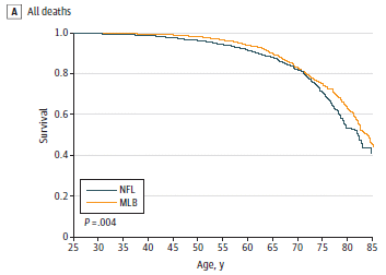
|
The graph shows the survival curves for two groups of athletes: those who played professional-level football (NFL; dark line) or baseball (MLB; yellow line).
The baseball players show higher survival than the football players. The difference tests as statistically significant; see the p value at the lower left. This is Figure 2A from the article. |
That is followed by analyses for deaths due to certain types of conditions. The following graph is the most striking of those. It compares the death rates for football and baseball players due to neurodegenerative disorders.
Both figures, and indeed all the survival curves in the article, follow the same basic layout. The color coding for the two sports is the same, as shown on the graph above. The x-axis scale (age) is the same. However, the scaling for the y-axis (survival) varies.
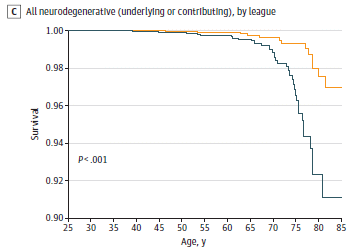
|
The two curves are very different. Look at the numbers, and you will see that the death rate is about three times higher for the football players (9%) than for the baseball players (3%) by the last time point.
That's the rate for cases where neurodegenerative diseases contributed to the death. The number of deaths considered here was 39 (NFL) and 16 (MLB). Those small numbers illustrate one of the difficulties in doing such analyses, especially as one tries to break the large group down into sub-groups. This is Figure 3C from the article. |
Taken together, the two graphs show that football players survive more poorly than baseball players. In particular, neurodegenerative diseases are a more prevalent factor in the deaths of football players. Other data in the article shows, for example, that football players also have a higher death rate from cardiovascular disease, but that the death rates from cancer are about the same for the two groups.
But perhaps we have not yet gotten to the interesting issues. What are these data sets, and do they address the intended question?
The data sets themselves are logical enough, though it was surprisingly difficult to get them.
The original question was whether head injuries in football lead to a higher death rate. Compared to what? Logically, we might ask, compared to similar people who did not play football. But how could we collect a data set for such people? So, instead of analyzing what we really want, the scientists analyzed a data set that is available. The problem? Baseball and football are different; although both may involve extensive physical activity and training, they make different demands on the body. And it is likely that baseball players and football players are different types of people. We can't say that the differences in death rate observed here are due to the cause of interest (head injuries).
In fact, others have looked at the death rate for football players, using one or another control set, and found various things.
These comments are not a criticism of the work or of the article. The authors are clear about what they did, and they discuss the limitations. Further, the accompanying commentary focuses on them. The caution is that simple summaries of the work may lose the nuances. The article is a useful contribution to the story of the aging of athletes; it provides one more piece of a big puzzle.
News stories:
* Pro Football Players Die at a Higher Rate than Pro Baseball Players. (J Akst, The Scientist, May 28, 2019.) Now archived.
* NFL Players Have a Higher Rate of Mortality than Major League Baseball Players. (R Dillard, DocWire News, May 28, 2019. Now archived.)
* Commentary accompanying the article, freely available: Considerations for Present and Future Research on Former Athlete Health andWell-being. (Z Y Kerr et al, JAMA Network Open 2:e194222, May 24, 2019.) Reading this first could be good.
* The article, which is freely available: Mortality Among Professional American-Style Football Players and Professional American Baseball Players. (V T Nguyen et al, JAMA Network Open 2:e194223, May 24, 2019.)
A background post on football injuries: Evidence for brain damage in players of (American) football at the high school level (August 23, 2017).
A reminder about interpreting statistics... What does a p value mean? Statisticians make a statement (August 6, 2016).
More athletes... High-performing athletes: might they have performance-enhancing microbes in their gut? (June 28, 2019). (Just a couple posts below.)
Among posts about baseball...
* Effect of climate change on baseball games (June 10, 2023). Links to more.
* The origins of baseball -- two million years ago? (August 18, 2013).My page for Biotechnology in the News (BITN) -- Other topics includes sections on Aging and Brain (autism, schizophrenia). Each of those includes a list of related posts.
There is now an extensive list of sports-related Musings posts on my page Internet resources: Miscellaneous under Sports.
June 30, 2019
We get a lot of earthquakes in California.
A recent article re-examines the seismological records, and finds a million more quakes than we had thought. That's for a ten-year period (2008-17), and is for Southern California. The count rose about 10-fold, to about 1.8 million.
The approach was to use a more sensitive analysis, thus increasing the detection of small quakes. The quakes added to the catalog were below magnitude (M) about 2 -- mostly below M 1.
No surprise. It's well known that the number of quakes is much larger for low magnitudes. The important question is whether knowing about the smaller quakes matters. These are quakes that would probably not be noticed by anyone, but which are part of the story of what the ground is doing. The graph below suggests that they might matter.
In August 2012, there was a significant earthquake (M > 5) near the Southern California town of Brawley. The graph shows the time course of quakes recorded in the area over a three day period.
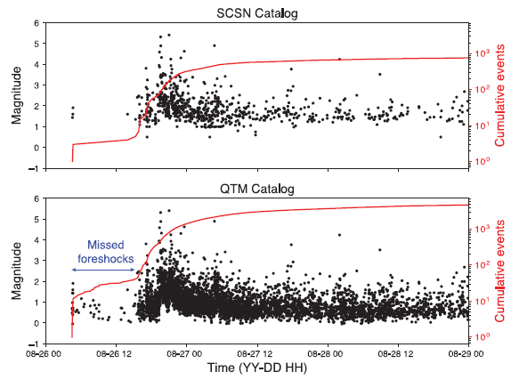
|
Look at the upper graph. It shows the quakes vs time. Each point is for one quake: magnitude (left-hand y-axis) and time (x-axis; the tic marks are 12 hours apart).
The first events shown are three quakes with M just below 2. There is then a gap of about 10 hours during which no quakes were recorded. The gap is followed by a swarm of quakes, including the "main event": two quakes with M > 5. (And there were eight more quakes with M > 4 over two days.) That's the analysis based on the "old" catalog, labeled here as the SCSN Catalog. Now look at the lower graph. Same time, same place, but using the larger catalog that was developed with the lower threshold (QTM Catalog). The gap seen in the top graph is now full of many -- tiny -- quakes. The accompanying map shows that most of these tiny quakes were fairly close to the site of the main (M 5) quakes that followed soon. The red curve? It shows the cumulative count vs time, for quakes of any magnitude -- from that catalog. Log scale. It's not particularly important here, but you might note that the final total is about 10-fold higher with the new catalog. See the right-hand y-axis scale. The two catalogs? SCSN = Southern California Seismic Network. QTM = quake template matching. The x-axis is almost certainly mislabeled. The first two digits are for the month (MM; August), not the year (YY). This is the left side of Figure 3 from the article. |
The significance of the three early quakes (M ~ 2) changes when we see the more complete record. Instead of being an isolated cluster of quakes, they are now connected to the main event. The tiny quakes, newly revealed here, during the gap seem to point to the main event that is coming. Are such tiny quakes, in general, useful information? The only way we can find out is to see the more complete record for many events, and learn from the experience.
In any case, the new work is an advance in analyzing seismological data. It should lead to a better understanding of what is underground.
How does one go back and find tiny quakes in the records? It's a signal-noise problem. The key to uncovering more signals among the noise is more detailed analysis, which allows the scientists to recognize features in the data that are typical of a particular location, and also to correlate data from nearby locations. It's computationally expensive!
News stories:
* Scientists Have Identified Almost 2 Million 'Hidden' Earthquakes Shaking California. (P Dockrill, Science Alert, April 23, 2019.)
* Scientists identify almost 2 million previously 'hidden' earthquakes -- A closer look at seismic data from 2008-17 expands Southern California's earthquake catalog by a factor of 10. (EurekAlert! (Caltech), April 23, 2019.)
* News story accompanying the article: Geophysics: The importance of studying small earthquakes. (E E Brodsky et al, Science 364:736, May 24, 2019.)
* The article: Searching for hidden earthquakes in Southern California. (Z E Ross et al, Science 364:767, May 24, 2019.)
Among posts about California earthquakes...
* Earthquakes induced by human activity: oil drilling in Los Angeles (February 12, 2019).
* A significant local earthquake: identifying a contributing "cause"? (July 31, 2018).
* How PBRs survive major earthquakes; why being near two faults may be safer than being near just one (September 22, 2015).Another million quakes... A model system for making millions of earthquakes in the lab (August 6, 2019).
June 28, 2019
An intriguing article!
Let's start with a summary of the findings and interpretation, as a framework...
1. The scientists find higher levels of a certain type of bacteria in the guts of people following a marathon.
2. Inoculating those bacteria into mice improves their endurance.
3. From knowing the biochemistry of these bacteria, there is a plausible explanation for how this might work.
The following figure shows some of the results for the runners...
|
In this figure, each column is for one runner from the 2015 Boston Marathon. Each row is for one day, from 5 days before the race (-5) to 5 days after the race (+5). The days are shown on the right-hand y-axis.
On each day, fecal samples from each runner were tested for the abundance of various bacteria, using analysis of the ribosomal RNA. Each bar shows the relative abundance of Veillonella bacteria. That relative abundance is shown on the left-hand y-axis. (I think that the scaling is the same for all graphs. Therefore, your visual impression of bar height is meaningful and can be compared throughout the figure.) |
|
That is, each column shows how the abundance of Veillonella bacteria changed over time for a specific runner. Each row shows the abundance in the set of runners at a given time. For example... The first runner (SG01) had a level of Veillonella at day -5 that was below the limit shown here, but the amount increased in the days leading up to the race (presumably due to training). (Day -1 doesn't quite fit; samples vary, for reasons we don't understand.) The amount of Veillonella increased further on days 2 and 3 following the race, then declined. One big observation is that people vary! But it also seems that there is a tendency for the amount of Veillonella bacteria to be higher after the race, at least for some people. Veillonella is the only bacterium examined for which there is any suggestion of a change associated with the race. This is Figure 1b from the article. The runners were chosen as middle-of-the-pack. That is, these are not the elite of marathoners, but they are serious exercisers. | |
Results such as those pointed to Veillonella as possibly being of interest. That led to a controlled test -- with mice.
|
The general nature of the test is that the mice were asked to run for as long as possible; it is an endurance test. There were two treatments: the mice were treated (intrarectally) with either Veillonella bacteria (a strain of Veillonella atypica isolated from the marathoners) or control bacteria (Lactobacillus bulgaricus).
The y-axis shows the endurance result: how long each mouse ran until it stopped, presumably of exhaustion. (Actually, each mouse had three trials, and the result reported here was the longest time it achieved in the three trials.) The results show that the mice ran longer with the Veillonella bacteria (right-hand data set) than with the control. The effect, while seemingly small, tests here as statistically significant. That is, the results suggest that giving the mice Veillonella bacteria improved their endurance. This is Figure 2a from the article. |
|
As we noted at the top, there is a plausible biochemical explanation for the effect. Veillonella bacteria can metabolize the lactate that builds up during exercise. The bacteria convert lactate to propionate, which is useful.
The control bacteria, a Lactobacillus, may well be making lactate; that complicates the interpretation. This point needs to be sorted out in further work.
As you read about this work, be sure to distinguish two issues. One is... Do athletes make use of a natural shift in their microbiome, involving Veillonella bacteria and lactate metabolism, to achieve higher performance? That's the focus of the article itself, and there is at least suggestive evidence, as well as a plausible mechanism, to support the claim.
Beyond that, it's easy to imagine how this might be used -- and the questions it could lead to. In the context of competitive athletics, even small improvements can be important. Interestingly, beyond the article the authors even suggest that their findings might be of use for those who simply don't exercise much, though there is no particular evidence to support that suggestion.
In terms of the work leading to a "useful" treatment for enhancing exercise, we should note one further result from the article. Giving the mice propionate led to a performance gain similar to that seen with the Veillonella bacteria. It is possible that the main benefit of the bacteria is making propionate, a useful energy source (rather than reducing lactate).
News stories:
* Microbiomes of Elite Athletes Contain Performance-Enhancing Bacteria. (GEN, June 25, 2019.)
* Could a Gut Bacteria Supplement Make Us Run Faster? Running a marathon ramps up levels of a gut bacteria that made mice run faster, but it's unclear whether it would work in people. (G Reynolds, New York Times, June 26, 2019. Link is now to Internet Archive.) Good discussion of the limitations of the work so far.
* Discovery of performance-enhancing bacteria in the human microbiome -- A single microbe accumulating in the microbiome of elite athletes can enhance exercise performance in mice, paving the way to highly-validated performance-enhancing probiotics. (B Boettner, Wyss Institute (Harvard), June 24, 2019.) From the lead institution.
* News story in another member of the journal family: Microbiome: Working out the bugs: microbial modulation of athletic performance -- A multi-faceted translational study provides the first evidence that gut microbial conversion of lactate to propionate may enhance athletic performance during high-intensity endurance exercise. (R N Carmody & A L Baggish, Nature Metabolism 1:658, July 2019.)
* The article: Meta-omics analysis of elite athletes identifies a performance-enhancing microbe that functions via lactate metabolism. (J Scheiman et al, Nature Medicine 25:1104, July 2019.)
The article discloses that some of the authors have formed a company, presumably to develop the findings into a commercial product.
* * * * *
More about improving the endurance of mice: Sparing glucose for athletic endurance (August 21, 2017).
A recent post about the human gut microbiome: How a "low-gluten" diet may benefit those who are not gluten-sensitive (January 27, 2019).
More... Metabolism of the Parkinson's disease drug L-DOPA by the gut microbiota (July 26, 2019).
More about running: Should you run barefoot? (February 22, 2010). Links to more.
More about exercise: How exercise benefits the brain (August 9, 2020).
Next post about athletes... Comparing the death rates of American football and baseball players (July 2, 2019). Just a couple posts above.
There is now an extensive list of sports-related Musings posts on my page Internet resources: Miscellaneous under Sports.
June 26, 2019
A database of women scientists. A resource for making connections. One aspect of that is promoting the involvement of women in activities such as conferences and news resources. All levels of involvement, all fields of science, everywhere. Seems like a good idea; please read and share.
* News story: Scientists create international database of women scientists. (Phys.org (University of Colorado), April 23, 2019.) Links to the article, which is freely available, and directly to the database web site. The article describes the purpose, the first year of experience, and plans. The database is called 500 Women Scientists; as of the article, it includes over 7,500.
* Also see... Women in science: How about at the highest level, the national academies? (April 12, 2016).
June 25, 2019
Growing maize results in about 4300 deaths in the United States each year. The main reason is the ammonia released from fertilizer.
That's the gist of a recent article. It is based on modeling the total corn-growing process.
The following figure summarizes the main findings, and also gives an idea of the nature of the analysis.
|
Start with the bar at the left. It is for total PM2.5 -- fine particulate matter. (The 2.5 refers to the particle size: smaller than 2.5 micrometers.) The total height of that bar shows that PM2.5 from growing corn results in a total of about 13 deaths per million tons of corn per year.
The parts of that bar show the contributions of various process steps to the total. The biggest contribution, by far, is "yellow", for on-field corn production. (The other steps that contribute are listed in the key at the upper right; many are related to fertilizer production.) The other bars are for types of chemicals that contribute to the total load of PM2.5. The largest, by far, is ammonia, NH3, again related to on-field corn production. "Primary" PM is that produced directly from combustion. "Secondary" PM is that made by atmospheric chemistry from the indicated source. You may wonder... synthetic fertilizer vs animal manure? Both release NH3. The latter is particularly bad. This is Figure 5a from the article. |
The problem, of course, is that corn needs nitrogen -- usually considerably more than is present in the soil. Therefore, farmers fertilize the crop with an N-containing fertilizer. However, much of that N ends up in the air, largely as ammonia. In addition to the direct effect of NH3 (the odor), much of it ends up as particulate matter, the small kind that may be the worst, as it embeds deep in the lungs.
It's all modeling. That's about all one can do; there is usually no way to trace an individual death to a specific pollutant source. The quality of the conclusions depends on the input numbers and the modeling assumptions. The authors have made a start, and published what they did. Others are free to challenge numbers and assumptions; over time that process leads to a better understanding.
But for now, the message is that fertilizer use in growing maize is leading to more air pollution. Can we learn to fertilize better?
Perspective... It's hard to get a big picture from the article. How big is this problem compared to other pollution problems and causes of death? One comment suggested that, in regions with a lot of corn, the ammonia from growing the corn may be the major source of air pollution. The article does contain estimates of the damage in economic terms. The numbers are big, but it is hard to put them in perspective. The important point here is to develop our understanding of growing corn, and to ask if we can do better.
News stories:
* Air pollution from corn kills thousands of people each year. (M Andrei, ZME Science, April 17, 2019.)
* Corn Pollution Kills Thousands of Americans a Year, Study Finds. (Y Funes, Gizmodo, April 5, 2019.)
The article: Air-quality-related health damages of maize. (J Hill et al, Nature Sustainability 2:397, May 2019.)
A recent post about ammonia pollution: Global map of ammonia emissions, as measured from space (January 22, 2019).
Posts about agricultural issues:
* Evaluating the sustainability of food systems (December 5, 2022).
* Implementing improved agriculture (January 6, 2017).More about corn: What can we learn from a five thousand year old corn cob? (March 21, 2017).
June 23, 2019
A recent article reports observations of whales from space -- using the latest in high resolution satellite technology.
Here are two of the photos...

|
Not very clear? You do see the fluke?
This is the bottom row of Figure 2 from the article. |
How are the scientists so sure they can identify whales? Of course, they have the original digital photos, which they can subject to various analyses.
A big problem is distinguishing whales from objects of similar size over the ocean. The article presents some typical photos of boats and planes. The plane wings are clear. And the complexity of the boat seems different from the generally uniform whale.
The satellite images provide additional data. For example...
|
The graph shows the radiance measured by the satellite sensors for four spectral bands. (NIR1 is a near-infrared band.)
The radiance is the reflected light as measured at the satellite. Radiance is shown here for three ocean water locations, and for one type of whale -- the fin whale in this case (black line; solid circles). |
|
You can see that the spectral information is somewhat helpful in distinguishing animal from water. The spatial resolution is 1.24 meters for these spectral bands. (It is about 30 cm for black and white images.) This is slightly modified from the upper right frame of Figure 4 from the article. I have restored the axis labels. The full figure shows similar results for other types of whales; each type has a distinctive spectrum. The authors note that the fin whale, data for which is shown above, is one of the easier types to detect. | |
The analysis is complex; I have only hinted at some of the issues above. The goal, of course, is that the images will be analyzed automatically by computer. Complex analysis is fine, if it works. The exploratory work, such as above, provides the basis for the analysis.
Overall, the authors think their analyses are rather good. Certainly, they are better than what had been available previously. But there are still significant limitations. For example, the ability to detect calves -- and smaller species -- is limited.
The point of all this? Monitoring whale populations is still a big issue. Satellites have the potential to provide comprehensive coverage in both time and space.
News stories:
* Watching Whales from Space. (ECO Magazine (British Antarctic Survey), November 1, 2018.)
* Whale-Watching from Space: Why Satellites Are Monitoring Wildlife. (M Prosser, Singularity Hub, December 13, 2018.)
The article, which is freely available: Whales from space: Four mysticete species described using new VHR satellite imagery. (H C Cubaynes et al, Marine Mammal Science 35:466, April 2019.) VHR = very high resolution.
Previous post about whales: A better way to collect a sample of whale blow (November 28, 2017).
More on aerial monitoring...
* Counting trees on Earth from space -- at one-tree resolution (January 12, 2021).
* An ion-drive engine for an airplane? (February 15, 2019).
* Global map of ammonia emissions, as measured from space (January 22, 2019).
* Improved high altitude weather monitoring (July 18, 2016).Among many posts about boats... Colloidal microswimmers: 3D printing a micro-boat (December 13, 2020).
June 21, 2019
What's a sticky pesticide? Think about how a pesticide is used. You spray it onto a plant. Then the rain comes, and your pesticide ends up in the river. A sticky pesticide would stay on the plant when it rains.
A recent article reports making a sticky pesticide. The new pesticide contains two protein domains. One domain sticks to the waxy layer of the leaf; it is hydrophobic. The other domain is the active agent.
Some results...
The first figure shows that the leaf-binding domain works. The test here is with a simple model system, using leaves in the lab. The test pesticide was applied to the leaves, and then the leaves were rinsed.
|
In this test, green fluorescent protein (GFP) was used as the "active" domain -- something one can see. (eGFP? The e means enhanced.) It was attached (or not) to another domain, which may (or may not) promote rain-resistant binding to the leaf.
The top row of pictures shows the results before the leaves were rinsed; the bottom row shows the results after rinsing (lab rain). Start with the right-hand column. That is for GFP alone. It bound to the leaves before rinsing, but was easily rinsed off. The first two columns show the results for two different two-domain proteins, with the GFP attached to a sticky domain. The sticky domain candidates are called THA and LCI. Both stuck and survived the "rain": substantial amounts of GFP were seen on the leaves after the rinsing. The scale bar is 0.25 millimeters. So, each image is about a millimeter across. This is Figure 1B from the article. |
So it binds. Does it do real biology? The next figure shows the results for a real biological test, though still with a simple lab system. In this test, a two-domain protein was used, containing the sticky THA domain shown above and a domain, called DS01, known to inhibit the fungus that causes Asian soybean rust.
|
In this test, soybean leaves were infected in the lab with the fungus.
The figure shows the severity of infection following two treatments. The left-hand treatment was just water; the average severity for this control was set to 100%. The right-hand treatment was with DSO1-THA -- the two-domain protein with one domain each for sticking and for killing the pest. The pesticide was applied, and the leaves were rinsed. You can see that the severity of infection was significantly lower with the new pesticide. Again, this is with rinsing. This is slightly modified from Figure 7b of the article. I added a label on the y-axis. |
How good is it? It's hard to tell. There is no reference data for other pesticides that might have been used here (without rinsing).
So let's just take this as proof of principle. They designed and made a pesticide with a new property. It worked. The goal seems good, and the approach seems sound. I am surprised that this has not been done before; showing that it can work in a model system may open the door to further development.
I suggested earlier that the pesticide binds to the waxy layer on the left surface. Evidence? Aside from the hydrophobic nature of the binding domain... It binds less well to leaves lacking the waxy layer (because of either mutation or chemical treatment).
News story: Rainproof pesticide uses sticky peptides to defend against Asian soybean rust. (A Shearer, Chemistry World, May 13, 2019.)
The article, which is freely available: A bifunctional dermaseptin-thanatin dipeptide functionalizes the crop surface for sustainable pest management. (P Schwinges et al, Green Chemistry 21:2316, May 7, 2019.)
Among posts about pesticides: Largest field trials yet... Neonicotinoid pesticides may harm bees -- except in Germany; role of fungicide (August 20, 2017). This may lead to the question of the environmental impact of the new type of pesticide. Of course, the purpose is to reduce the amount "in the river" -- pollution beyond the plant. The effect on the amount of pesticide on the plant, to a first approximation, might seem zero. I can think of reasons why it might be otherwise, in either direction. It probably depends on the specifics. The question remains on the table, and needs to be addressed for any specific pesticide and application.
Posts about soybeans include the following consecutive posts...
* Improving soybean oil by using high voltage plasma (January 9, 2017).
* Improving soybean oil by gene editing (January 8, 2017).And... How soybeans set up shop for fixing nitrogen -- and how we might do better (December 2, 2019).
More about the fungal disease known as rust... Disease transmission by sneezing -- in wheat (July 29, 2019).
June 18, 2019
Small nucleons. Some neutrons and protons, especially in heavy atoms, are smaller than usual. It happens when two nucleons, most often one neutron and one proton, momentarily pair up. Measuring the size of a nucleon, using electron scattering, is not a trivial matter.
* News story: Correlated nucleons may solve 35-year-old mystery. (Phys.org (Thomas Jefferson National Accelerator Facility), February 20, 2019.) Links to the article.
June 17, 2019
Updated October 16, 2019...
The article that was the basis of this post has been retracted.
The authors requested retraction when they found a bias in the database used for the study.
Journal site: retraction notice. The retraction was posted by the journal on October 8, 2019. If you link directly to the original article, the retraction is noted there.
The original article discussed here provided evidence that a mutation known to confer resistance to HIV reduces lifespan. That conclusion was based on statistical analysis from a major database. The article noted various reservations about the analysis. Indeed, follow-up has made it clear that the database used for the analysis contained a systematic bias, which impacted the conclusion. The original article has been retracted, and a new article submitted. The authors of the original article are among the authors of the new article.
News story: Science journal retracts article linking CCR5 deletion to reduced life expectancy. (R Jefferys, HIV i-BASE, October 10, 2019.) Links to a preprint of the new article (ref 8; also shown below). Also links to the original article (ref 1; it is in Nature Medicine, not Nature as listed there) and the retraction notice (ref 5).
The new article, which is freely available as a preprint: No statistical evidence for an effect of CCR5-Δ32 on lifespan in the UK Biobank cohort. (R Maier et al, BioRxiv, October 2, 2019.) This is a preprint, posted here prior to peer review.
* The published article: No statistical evidence for an effect of CCR5-Δ32 on lifespan in the UK Biobank cohort. (R Maier et al, Nature Medicine 26:178, February 2020.)
* * * * *
The post, below, remains as it was originally, except for updating links.
CCR5 is a human gene best known for its relevance to HIV. The CCR5 protein is the major receptor for HIV (more specifically, for the common HIV-1). Some people -- a few percent of the population -- carry a CCR5 mutation, with 32 bases of the gene missing. That is called CCR5-Δ32, where the Δ indicates a deletion. The mutation appears to lead to loss of any active protein for the gene. People with two copies of the mutant gene are substantially resistant to HIV, and, at least superficially, appear otherwise normal.
A case where an HIV+ person received the CCR5 mutation as a result of a bone marrow transplant received attention several years ago. The person became HIV-; residual virus could not get into any new cells. A second such case was noted recently.
There is another reason CCR5 has been in the news recently. We'll leave that for the moment.
How good is the story that people with the CCR5 mutation are otherwise normal (in addition to being HIV-resistant)? A new article examines a database of 400,000 individuals, and looks at survival as a function of the CCR5 genotype.

|
The graph shows survival (y-axis) vs age (x-axis) for three groups of people in the database.
The three groups are classified by a single criterion: their genotype for CCR5. For simplicity, we refer to the Δ32 mutation as "-". Each person is either +/+, -/+, or -/-. Survival is shown relative to the start age for this graph, which is 41. (That is the youngest age for which the database provides useful data.) You can see that people carrying two copies of the mutated form of the gene (-/-; black curve) have lower survival than the other two groups. (There seems to be no difference between the people with one or two copies of the normal form of the gene.) The database used here is the UK Biobank. Analysis is restricted to those of British ancestry. This is Figure 1a from the article. |
The graph shows survival. Another way the results are presented is with death rate, which is (1 - survival rate). For example, if the survival is 85%, then 15% have died. The analysis for age 76 (not quite the end of the graph, but the highest age with enough numbers for good statistics) shows that the -/- group has a 20% higher death rate over the age range shown.
That is, the CCR5 mutation, which leads to resistance to HIV, overall leads to lower survival.
Why? There is nothing in the current work to address that point. However, there is other work suggesting that the CCR5 mutation leads to increased death from influenza, and adversely affects some other diseases. Since CCR5 is a normal part of our immune system, even if we don't know exactly what it does, it shouldn't be surprising that it is beneficial.
How solid is the conclusion here? Well, it is a single study. It is based on a single database, focusing on people of one type of genetic background. It does not address people of any other group. The way the database is maintained, it is subject to some biases. However, it seems likely that the biases would not affect the general conclusion here.
That is, the study has limitations. Hopefully, other analyses will be done. In the meantime, the analysis here suggests the effects of CCR5, whose biological role is poorly understood, is complex.
There is one more point to be noted about the CCR5 mutation. There was a big news story in recent months about two babies being born after having their CCR5 genes inactivated (using CRISPR for gene editing). The work was met with outrage for a number of reasons. We can now add to those reasons... The genetic mutation they received may well do the kids harm.
News stories:
* Genetic Mutation that Prevents HIV Infection Tied to Earlier Death. (E Yasinski, The Scientist, June 3, 2019.) Now archived.
* Expert reaction to mutated CCR5 gene and mortality. (Science Media Centre, June 3, 2019.) Comments from experts.
* News story accompanying the article: HIV infections: The hidden cost of genetic resistance to HIV-1 -- Assessment of more than 400,000 people over the age of 40 demonstrates that homozygosity for a CCR5 variant that prevents HIV-1 infection comes at the cost of increased rates of mortality. (J Luban, Nature Medicine 25:878, June 2019.)
* The article: CCR5-Δ32 is deleterious in the homozygous state in humans. (X Wei & R Nielsen, Nature Medicine 25:909, June 2019.)
A recent post about CCR5: Role of a receptor for HIV in stroke recovery (March 23, 2019). This post suggests that CCR5 may be relevant in recovery from stroke. More specifically, it suggests that the wild type CCR5 inhibits stroke recovery. The big point for now is to emphasize how little we understand about CCR5. (The article discussed in this earlier post is reference 8 of the current article.)
My page for Biotechnology in the News (BITN) -- Other topics has a section on HIV. It includes a list of related posts.
June 16, 2019
How do planetary moons form? There are various possible ways. How did Earth's Moon form? We're still trying to figure that out.
In recent decades, the main view has been that the Moon was formed following a collision of another substantial object (Mars-size?) with the early Earth. The Moon formed from the ejecta of that collision. The invading object, known as the impactor, has gained the name Theia.
It's an interesting and appealing idea. However, as we learn more about Moon and Earth, the new data provide constraints on what happened. So far, the picture is confusing. In particular, some aspects of the composition of Moon are surprisingly similar to those of Earth. That includes the content of specific isotopes. Common understanding of the collision suggests that the Moon should be more like the impactor. Further, most large bodies in the Solar System have distinctive isotopic compositions. We would guess -- but cannot know -- that the composition of Theia was distinct from that of Earth. Something doesn't fit. Musings has discussed the Theia problem before [links at the end].
A recent article offers a new solution to this dilemma. It's just a model based on simulations, but that's a useful step.
The key point of the new model is that it suggests that the surface of the Earth was liquid at the time of impact. With that change, the scientists now predict that the Moon would be formed largely of Earth material following the collision. The following graph summarizes the results of their simulations on this point...
|
The graph shows the composition of the ejected disk material over 70 hours following the collision. The y-axis is the mass of the disk -- in units of lunar masses.
You can see that the collision is a complex event, but that the ejecta disk is mostly blue and red material, with a composition that changes over time. It is mostly red by the end. Blue and red material? Blue is from the impactor; red is from the magma ocean (MO) on the Earth surface. That is, the collision ultimately produces a cloud of material that is mostly Earth. And that is how, according to this model, the Moon is so similar to the Earth. The figure also shows a small amount of gray material. That is material from the cores of the two objects. It's not important in the long run. This is slightly modified from Figure 1c of the article. I have added text labels to identify the two main materials. |
The scientists explicitly show in their modeling that the difference between liquid and solid silicate minerals matters. They have very different heating characteristics.
The model also explains one additional feature of the Moon. It has a surprisingly high content of FeO (iron(II) oxide, or ferrous oxide). The model here offers an explanation: the proposed MO probably would have been enriched in FeO.
The main novel feature here is the proposal of the magma ocean at the Earth surface. Is this a reasonable idea? There have been other proposals to explain the similarity of Moon and Earth compositions, but they have made assumptions not considered reasonable. In this case, the key assumption is indeed reasonable, even likely for at least some time during the early history of Earth.
That's it. A new model, and computer simulations to see what would happen if Theia collided with an Earth with a liquid surface. There are a lot of details in the modeling, but the big message is that such a collision could account for what we know about Earth and Moon. The new model is now on the table, for critique and further development.
News stories:
* Ocean of magma blasted into space may explain how the moon formed. (T Puiu, ZME Science, April 30, 2019.)
* Behind the paper: Terrestrial magma ocean origin of the Moon. (N Hosono, Nature Research Astronomy Community, April 29, 2019.) By the lead author of the article.
* News story accompanying the article: Planetary science: Why the Moon is so like the Earth -- The Moon's isotopic composition is uncannily similar to Earth's. This may be the signature of a magma ocean on Earth at the time of the Moon-forming giant impact, according to numerical simulations. (H J Melosh, Nature Geoscience 12:402, June 2019.)
* The article: Terrestrial magma ocean origin of the Moon. (N Hosono et al, Nature Geoscience 12:418, June 2019.)
Background posts:
* The collision of Theia with Earth: head-on? (February 29, 2016).
* Birth of the Moon: Is it possible that Theia was similar to Earth? (June 20, 2015).More about the Earth's moons: How many moons hath Earth? In: Briefly noted... (September 5, 2018).
* * * * *
Update added December 7, 2023...
A new article suggests that anomalous regions in the Earth mantle may represent remains of another planet -- perhaps Theia. Fascinating! Caution... It's mostly modeling at this point. Provocative, but speculative. In any case, it is further exploration of planetary dynamics.
* News story: Heterogeneity of Earth's mantle may be relics of Moon formation. (EurekAlert! (Chinese Academy of Sciences), November 1, 2023.)
* The article: Moon-forming impactor as a source of Earth's basal mantle anomalies. (Qian Yuan et al, Nature 623:95, November 2, 2023.) Check Google Scholar for an available copy.
June 12, 2019
Jackass and fish. If you're one of those who thinks it is cute to put a live fish down your throat, at least you should know about fish that erect barbed spines on their body to defend themselves when distressed.
* News story: This Is What Happens When You Drunkenly Swallow a Live Catfish -- A hard lesson in a very strange party tradition. (H Weiss, Atlantic, January 26, 2019.) Links to the article, in the journal Acta Oto-Laryngologica Case Reports; it is freely available. The news story itself perhaps provides some useful perspective on the broader issues.
June 11, 2019
Even very simple organisms modify their behavior based on experience. For example, the slime mold Physarum polycephalum is repelled by sodium ions. However, if exposed to Na+ over time, the organism learns to tolerate it. The process is commonly called habituation. In some way, the slime mold must "know" and/or "remember" that sodium is ok. However, slime molds have no nervous system.
A recent article explores how they do it. Here are some results, establishing the basic phenomenon...
|
In this test, the slime molds need to cross a bridge that has a high concentration of Na+ in order to get to some food. The aversion index shown on the graph in part a (y-axis) is related to the time it takes them to do so.
Two groups of slime molds were tested. One group was habituated to sodium ions; the other group was a control, untrained group. Testing was done after 1 and 6 days of habituation. You can see that both groups scored similarly at day 1. However, by day 6 of training, the habituated group showed very little aversion to the sodium ions. Part b of the figure (right side) shows the amount of Na+ in the two types of cells (day 6). You can see that there is much more Na+ in the habituated cells, which were exposed to high levels of it. For now, just take this as an observation, one that is perhaps not surprising. This is part of Figure 2 from the article. |
Part a above shows habituation, which we might consider a form of learning. It says nothing about memory, at least long-term memory.
The following test was done with the habituated culture a month later. Actually, it's a little more complicated than that. Under normal conditions, the slime molds would lose their stored sodium -- and their habituation -- within a few days. What was done here was to store the slime molds in a dormant state. The results...
|
Two different measures were used here, but they are closely related. By either measure, the habituated cells showed low aversion, compared to the controls.
This is Figure 3a from the article. |
The habituated slime molds remembered that Na+ is ok, even after a month of storage under conditions of physiological dormancy.
The question, then, is how these little things store their memories. The authors make a case that the stored Na+ is the memory. In one experiment, they injected Na+ into the cells, and showed that they now behaved as if they are habituated.
Perhaps what is most important is that the scientists are studying the nature of memory in such an organism, and have a model that is a start toward describing a mechanism of how this "liquid brain" works.
News stories:
* Slime moulds learn by absorbing substances. (M Andrei, ZME Science, April 22, 2019.)
* Slime mold absorbs substances to memorize them. (Phys.org (CNRS), April 22, 2019.)
The article: Memory inception and preservation in slime moulds: the quest for a common mechanism. (A Boussard et al, Philosophical Transactions of the Royal Society B 374:20180368, April 22, 2019.) The journal issue has the theme of exploring the differences between "liquid" and "solid" brains.
A post about cellular slime molds: Farming by amoebae (February 15, 2011). This also serves as a reminder that the term slime mold is used for two unrelated types of organisms: the true slime molds of the current post, and the cellular slime molds of this earlier post.
More about memory in simple organisms: Can memories survive if head is lost? (November 23, 2013).
My page for Biotechnology in the News (BITN) -- Other topics includes a section on Brain (autism, schizophrenia). It includes an extensive list of brain-related Musings posts.
June 10, 2019
Mix some chemicals together, under the right conditions, and life will emerge. Something like that must have happened long long ago. But what, how, when, where -- pretty much all the questions a journalist would ask -- are unknown, and perhaps unknowable.
The classic Miller-Urey experiment of 1953 showed that some biochemicals can be generated abiotically. A recent article reports an unusually intriguing example: a simple set-up and a rich mixture of life's chemicals.
What did the scientists do? Mix (n water) two simple organic molecules: pyruvate and glyoxylate. Add some Fe2+ (ferrous) ions. Check back in a while. The two organics are likely to be formed abiotically; ferrous ions would have been abundant in the ancient prebiotic world, with no oxygen in the atmosphere.
Here is part of what they found...
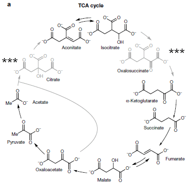
|
The figure shows the citric acid cycle of modern organisms. (It is also known as the TCA cycle or Krebs cycle.) The format of the cycle shown here is a little odd, but that doesn't matter for us.
The chemicals of the cycle that were made in their reaction mix are shown in dark type. The chemicals that were not detected in the analysis are shown in light type (and marked with ***): citrate and oxalosuccinate. That is, of the 11 common biochemicals shown here, 9 were made in their reaction system. The two organic molecules used as initial reactants contain 2 and 3 C atoms. (Both are alpha-keto acids, present mainly as the anions. Glyoxylic acid is 2-oxoethanoic acid; pyruvic acid has one more C in the chain, as -CH3.) Molecules of various sizes, up to 6 C atoms, were made. That is, the system makes C-C bonds. (Both missing molecules had 6 C atoms.) The reaction system was run at 70 °C, well within the growth range of modern thermophilic microbes. The main distribution of chemicals was evident within a few hours. This is slightly modified from Figure 2a in the article. I added some *** for the two chemicals not found. |
In another part of their testing, the scientists added a nitrogen source (hydroxylamine) and metallic iron. The products then included four of the modern amino acids.
The authors discuss some of the chemical transformations observed. For example, they found both reductive and oxidative reactions. The initial Fe2+ can serve as a reducing agent. But that leads to Fe3+ appearing; it can then serve as an oxidizing agent.
What does one make of this? We have no idea how this might be relevant to the origin of life. It's a fascinating demonstration of what abiotic (prebiotic?) chemistry can do. It offers an example of how a plausible set of conditions could have led to an interesting set of chemicals. But life is much more than the citric acid pathway. On the other hand, there was lots of time available for many such pieces to come together.
News stories:
* Iron can catalyze metabolic reactions without enzymes -- Findings suggest that the abundant metal might have played a key role in early biochemistry before enzymes evolved. (A Katsnelson, C&EN, May 1, 2019.)
* Life's biochemical networks could have formed spontaneously on Earth. (Phys.org (University of Strasbourg), May 3, 2019.)
* News story accompanying the article: Origins of life: A possible prebiotic basis for metabolism -- Early life forms established a network of reactions for converting carbon dioxide into organic compounds. A non-biological system of reactions that could have formed the network's core on ancient Earth has been reported. (R Pascal, Nature 569:47, May 2, 2019.)
* The article: Synthesis and breakdown of universal metabolic precursors promoted by iron. (K B Muchowska et al, Nature 569:104, May 2, 2019.)
Also see:
* A special role for cyanide in the chemistry of early life? (April 25, 2022).
* Miller-Urey revisited: the role of the glass container (January 22, 2022).
* Modeling the role of hydrogen cyanide in the pre-biotic formation of life's chemicals (September 8, 2019).
* Can we pinpoint a specific molecular explanation for tissue damage following a heart attack? (March 24, 2015).
* Did life start in a geothermal pond? (February 28, 2012).
* I think I created life (May 21, 2009).
June 8, 2019
Four years ago, Musings noted the prediction and experimental finding that sulfur hydride is a superconductor [link at the end]. In fact, the work set the high temperature (T) record for superconductivity.
Ordinary sulfur hydride is H2S (hydrogen sulfide). The actual superconducting species is likely to be a "superhydride", such as H3S. The result is seen only at ultra-high pressure, which makes possible the superhydride configuration.
A year or so ago, some new predictions appeared. We now have an experimental test of one of those new predictions -- and a new record.
Here are some of the key results, from a new article...
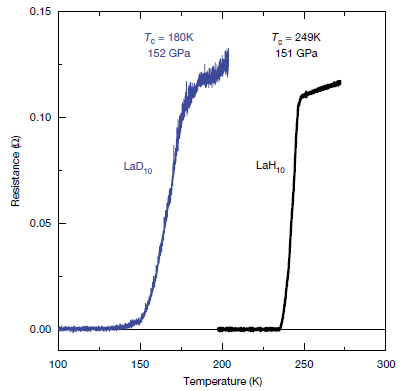
|
The graph is simple. Resistance (the reciprocal of conductivity) on the y-axis, T on the x-axis.
The results, too, are simple. It helps to read the graph "backwards", from right to left. Start at the high T. There is substantial resistance. At about 250 K, the resistance starts to drop -- and it is zero by about 230 K. The drop to zero resistance is the distinguishing feature of superconductivity. Scientists use a single number from the graph to describe where the superconductivity starts. The critical temperature (Tc) is where the curve begins its precipitous drop. Here, Tc is 249 K. It's a new record for high-T superconductivity. What is the substance? It is a hydride of lanthanum; a superhydride. LaH10. (Don't try to make sense of the chemical composition. Odd things happen at ultra-high pressure. And take the H subscript 10 as approximate.) It's about what was predicted. (The prediction was 270-290 K. The actual result here is not quite as high, but the general agreement is encouraging, given the difficulty of both the theoretical and experimental work.) The curve on the left? LaD10, where all of the H has been replaced by the heavy isotope D (deuterium). It, too, superconducts, but Tc is about 70 K lower. That shift, too, is about what the theory predicts. The low mass of the H plays a key role in the superconductivity; the higher mass of the D lowers Tc -- by both prediction and measurement. That may all seem simple, but the work is not. Synthesis and measurement take place in a diamond anvil cell. The Tc is measured here at 151 gigapascal. (1 GPa = 109 Pa ~ 10,000 atmospheres.) This is Figure 4 from the article. |
There are two important parts to this story. First, there is a new record. We like records. But second, this result was predicted, as was the previous one for sulfur hydride. Much of the history of superconductivity has been trial and error. There are theories, which sometimes work, and sometimes don't. Now scientists are predicting high-T superconductivity -- and then verifying it.
The superconducting hydrides, here with lanthanum and previously with sulfur, are metallic materials. As metallic superconductors, they follow the major theory for how superconductivity works. For many years the record holders for high-T superconductivity were non-metallic materials, for which there is no clear theory.
What's the next prediction? In fact, there is another prediction, and it is quite exciting. The theory predicts that a hydride of yttrium, YH10, will be superconducting at T around 320 K (47° C), once again at ultra-high pressure. That's not just room T; it is well above room T. (In the field of superconductivity, "room T" is often taken to be 273 K, or 0° C.) It's a non-trivial project to try to make it, but perhaps superconductivity at -- or above -- room T is almost here, with a theoretical underpinning.
There are actually two articles on superconductivity in lanthanum superhydride. They substantially agree on the big points, though the exact numbers are different for the two groups. The article discussed above, which was published last month, is from the same lab as the sulfur hydride work discussed in a previous post. The other article came out earlier this year. (It reports Tc "above 260 K".) Some news stories refer (and link) to both articles.
News stories:
* Another major step towards room-temperature superconductivity -- A hydrogen-rich material becomes superconductive under high pressure and at minus 23 degrees Celsius. (Max Planck Institute for Chemistry (Mainz), May 24, 2019.) From the lead institution for the current article.
* Viewpoint: Pushing Towards Room-Temperature Superconductivity. (E Zurek, Physics 12:1, January 14, 2019.) Refers to both articles. If you want optimistic predictions, see the final paragraph of this item.
* News story accompanying the article: Condensed-matter physics: Superconductivity near room temperature. (J J Hamlin, Nature 569:491, May 23, 2019.)
* The article: Superconductivity at 250 K in lanthanum hydride under high pressures. (A P Drozdov et al, Nature 569:528, May 23, 2019.)
Background post: What's the connection: rotten eggs and high-temperature superconductivity? (June 8, 2015). Note that this post links to two update posts on the story; the basic message remains the same. Links to more, on both superconductivity and unusual chemistry at high pressure. This post was made four years ago -- to the day.
More superconductivity: Superconductivity at room temperature -- at last (October 18, 2020).
Previous post about yttrium: Y-Y: the first (May 5, 2019).
More from a diamond anvil cell: Metallic hydrogen -- new evidence (March 7, 2020).
This post is listed on my page Introductory Chemistry Internet resources in the section Lanthanoids and actinoids.
June 5, 2019
Google Scholar (GS) and citation searching. Two recent articles suggest that GS may now be the largest database for scholarly or academic articles. That leads to... It may really be as good as any for doing a citation search. If you have an article and want to know what followed from it (that is, what articles cited it), find the item in GS and look at the bottom line, for citations.
* News story: Revisiting Google Scholar. (Swansea University, November 21, 2018. Now archived.) Very brief, but it links to both articles. The first one they list is freely available. The news story also links to a short guide to using GS, which is available in both English and Welsh. This guide, and other library guides linked there, are partially customized for their university, but much of the information is general.
* My page on Library matters includes a section on Citation searches. It provides a brief introduction to the why and how of doing citation searches. (Much of that page has information about the UC Berkeley library system, but this section is general.) I have added the information here to that section. (Hm... Some of the info for Web of Science is out of date. Gotta fix that.)
June 4, 2019
Artemisinin is a first-line drug for treating malaria. However, there is a serious problem of supplying enough of it. The drug is isolated from a particular plant, Artemisia annua -- from special glands on some leaf hairs.
A new article offers the prospect of an increased supply, from variants of the plant.
The basic finding is that, under some conditions, plants make the drug throughout leaf tissue, not just in the glands.
The following figure shows some data on that point...
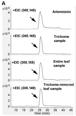
|
The figure shows the analysis of artemisinin in four samples, by a combination of chromatography and mass spectrometry.
More specifically, the graphs are for material of molecular weight 305; that's artemisinin. Each graph shows how material of that molecular weight came off the chromatography column. The simple result is that the same material was found in all the samples. What are those samples? Briefly, from the top down... - reference material (pure artemisinin); - material extracted from trichomes (leaf hairs); - material from total leaf; - material from leaves with the trichomes removed. When the results were expressed as concentration, the levels of the drug in the various tissues were similar. EIC? Extracted ion chromatograms. This is Figure S5A from the article supplement. |
That is, the finding is that artemisinin is made in non-gland tissue, too. Studies of the enzymes needed to make the drug show that the enzymes, too, are distributed throughout the leaf tissue.
What are the conditions that lead to the wider distribution of drug synthesis? The scientists have two conditions. One is from their own work... They find that inbreeding leads to plants with non-gland drug synthesis. The second is based on a gland-less mutant. They find that it, too, makes the drug.
The genetic basis of the effect is not clear in either case. Further, the drug levels are low in the current work. What makes the work of interest is that they have opened up the possibility of getting drug from more of the plant. Further work can build on this what is shown here; it might lead to plants with a greater overall production of artemisinin.
News story: Study upends 'dogma' on malaria drug component. (Phys.org (M Kulikowski, North Carolina State University), April 9, 2019.)
The article, which may be freely available: Artemisinin Biosynthesis in Non-glandular Trichome Cells of Artemisia annua. (R Judd et al, Molecular Plant 12:704, May 2019.)
I found parts of the article rather murky, including some aspects of the experiment I described above. As I read it, my sense was that I had confidence in what they claimed; the problem is with the writing of the article. The article mainly provides the basis for some further work; it does not itself claim a useful product. Therefore, I'm comfortable presenting the main ideas from it.
* * * * *
You may wonder... What about the process for making artemisinin using engineered yeast? They note it, and say that it has not yet proven itself economically.
* * * * *
A recent post about anti-malarial drugs: What if we gave mosquitoes anti-malarial drugs? (April 7, 2019).
Some of the work on developing a process for making artemisinin in yeast is noted on my page Internet Resources for Organic and Biochemistry under Alkenes.
There is a section of my page Biotechnology in the News (BITN) -- Other topics on Malaria. It includes a list of related Musings posts.
June 3, 2019
The mammalian brain decays rapidly after death; that's the dogma.
A new article suggests that it decays less rapidly than we thought.
It's a fascinating article, for the approach and for the findings. It's also important to understand the limitations of what was shown.
Here is the general approach... Pigs. Dead pigs. Four hours after death, the brains were hooked up to a device the scientists had developed; it perfused the brains with a specially designed fluid, which effectively served as a blood substitute. The scientists then made observations and measurements on the brains, over six hours.
The device is called BrainEx (or BEx). The term refers to it supporting the brain ex vivo.
The pig brains were obtained by arrangement with a local slaughterhouse. Thus the scientists had access to a large ongoing supply of brains, under fairly standardized conditions. However, these were not lab-grown pigs.
A simple summary is that treatment of brains with BEx perfusion resulted in improvements. The comparison was with brains not treated at all, or treated with a control perfusion fluid. Some aspects of BEx-treated brains appeared near normal, even ten hours after death.
At the outset... There is no evidence for any type of global brain function.
Here are examples of the measurements...
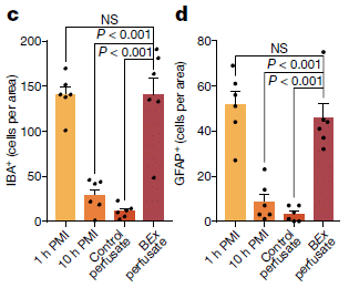
|
Part c (left side) shows the number of cells carrying a particular brain cell marker, called IBA1 (a marker for microglia).
The four conditions, from left to right, are... - 1 hour after death. PMI means post-mortem interval. This measurement is the earliest they can get; it is effectively a reference (baseline) value. - 10 hours PMI. No treatment. - 10 hours PMI. BEx device, with control perfusion solution (or "perfusate"). - 10 hours PMI. The treatment... BEx with the special perfusate they developed. The BEx treatments started at 4 h PMI. That is, the scientists measured the effect of six hours of treatment, started four hours after death. |
|
The results seem clear. The BEx treatment with the special perfusate restored the count of this type of cell to about the reference value. Without the treatment (middle two bars), that cell number dropped drastically. Microscopic examination of tissue samples showed that the cells were falling apart in the cases without full treatment. However, the full BEx treatment substantially reduced cell degradation. Part d (right side) is similar, for a second marker (GFAP, a marker for astrocytes). The results are similar. This is part of Figure 5 from the article. | |
That's the idea. The article contains lots of data. Measurements. Pictures of tissues. The example shown above is representative.
What's the take home lesson? Well, the scientists have developed a new method for studying dead brains. That in itself is a big deal. And some of the findings from this early work with the method suggests that brains survive better after death than we had thought. That's about where we should stop. We emphasize again, as they do in the article, that they have not restored "brain function" in any big sense.
The work will continue.
News stories:
* Restoration of Brain Circulation and Cellular Function after Death. (D Joye, BrainPost, April 23, 2019.)
* The pigs were dead. But four hours later, scientists restored cellular functions in their brains. (S Begley, STAT, April 17, 2019.)
* Expert reaction to study on restoring cellular functions in the pig brain after death. (Science Media Centre (SMC), April 17, 2019.) As usual, the SMC presents the views of scientists in the field -- several of them in this case. They are in general agreement about what this article does and does not do. I encourage people to read at least part of this page for some professional perspectives on the work.
The work has, not surprisingly, raised ethical questions. The following pair of items, published together in Nature in the same issue as the article, are examples of discussions of the ethical implications. They are both freely available.
* Part-revived pig brains raise slew of ethical quandaries. (N A Farahany, Nature, April 17, 2019.) In print: Nature 568:299, April 18, 2019.
* Pig experiment challenges assumptions around brain damage in people. (S Youngner & I Hyun, Nature, April 17, 2019.) In print: Nature 568:302, April 18, 2019.
* News story accompanying the article, freely available: Neuroscience: Pig brains kept alive for hours outside body -- A system that revives pig brains after death raises a slew of ethical and legal questions. (S Reardon, Nature 568:283, April 18, 2019.)
* The article: Restoration of brain circulation and cellular functions hours post-mortem. (Z Vrselja et al, Nature 568:336, April 18, 2019.)
More about brains is on my page Biotechnology in the News (BITN) -- Other topics under Brain (autism, schizophrenia). It includes a list of related Musings posts.
That page also includes a section on Ethical and social issues; the nature of science. I have listed this post there.
May 31, 2019
Analysis of an unusual type of glass, found in the northern Sahara desert and used in artefacts found in the tomb of Pharaoh Tutankhamen (commonly called King Tut), suggests that scientists may be over-estimating the hazards from meteor strikes.
Here is an example of such an artefact...

|
It is a piece of armor, called a breastplate.
That yellowish piece near the center (maybe a bit greenish, too)... that's the part of interest. It is a sculpture of a scarab -- what we commonly call a dung beetle. (In ancient Egyptian culture, the scarab was considered responsible for rolling out the morning sun.) It's made from Libyan desert glass -- or LDG. (The major site for LDG is in modern Egypt.) This is (reduced and trimmed from) the second figure in the news story from ZME Science. |
What is the connection to meteors?
It is likely that LDG was made as a result of a meteor strike about 29 million years ago. However, there has been disagreement over what kind of an event was involved. One possibility is that the LDG resulted from a direct impact. But it is also possible that it resulted from the airburst around such an event. If the latter possibility is correct, it implies a huge event, with more than a hundred times the energy of the 2013 meteor strike in Siberia. On the other hand, if direct impact was involved, much lower energy events could have been sufficient.
Can we tell what kind of event caused the formation of LDG? Previous work on LDG samples had not yielded any evidence for direct impact. If there was no evidence for direct impact, it was plausible that high energy airbursts were involved. That is, the lack of evidence for direct impact effects became evidence suggesting the indirect airburst effects, which require much larger -- much more dangerous -- events.
And that leads to the current article. In this new work, the authors do new analyses of LDG samples. Some of the details they find can only be explained by the conditions of pressure and temperature that would occur with a direct impact.
If LDG was made by direct impact, it eliminates the need to invoke high energy airburst events to explain it. It doesn't mean such high energy events don't happen, but one type of evidence -- indirect evidence -- for them has been removed. Perhaps such events are not as common as we might have thought.
It's important to distinguish the experimental work and the discussion that follows. The experimental work creates facts. The analysis of the structure is complex, and the facts can be challenged by further work. Beyond the facts, there is interpretation and even speculation.
In any case, it's a fun story with many aspects. Maybe that is what makes it fun. Unusual rocks in the Libyan desert... rocks that make an appearance in the legendary tomb of King Tut, rocks that are slowly revealing their story, a story that may have implications for our future.
News stories:
* Scientists solve 100-year-old mystery of yellow desert glass prized by Egyptian pharaohs. (T Puiu, ZME Science, May 16, 2019.)
* Planetary scientists unravel mystery of Egyptian desert glass. (Phys.org (Curtin University), May 15, 2019.)
The article: Overestimation of threat from 100 Mt-class airbursts? High-pressure evidence from zircon in Libyan Desert Glass. (A J Cavosie & C Koeberl, Geology 47:609, July 2019.)
More from King Tut's tomb: The Most Remarkable Funeral Treasures (September 1, 2010).
A post about Egyptian mummies: How to make a mummy (May 7, 2023).
Previous post about scarabs: Dung beetles follow the Milky Way (February 24, 2013).
The 2013 Siberian meteor strike was among the events discussed in the post Of disasters, asteroids and meteors (February 19, 2013).
Another artefact with a meteorite connection: An extraterrestrial god (October 9, 2012). (Be sure to note the update at the end of the post. One of the original claims has been contested.)
More from the Libyan desert area: Hottest temperature ever recorded on Earth? Libya or Death Valley (California)? (June 30, 2013).
More glass: A new way to make impact-resistant glass (August 9, 2019).
May 29, 2019
Trees, land use, food -- and more. A recent post was about pollution from trees -- a complicating factor in considering the role of trees as a weapon against greenhouse gases. We now have two more "Comment" stories from Nature on aspects of the broad issue. The first emphasizes the difference between natural and "plantation" forests. The second deals with the land use implications of forests vs food production; it pleads for an integrated view. Each of these stories (the two here plus the earlier ones) is an interesting view of part of a big complex topic.
* "Comment" stories:
1) Restoring natural forests is the best way to remove atmospheric carbon. (S L Lewis, Nature, April 2, 2019.) In print, with a different title: Nature 568:25, April 2, 2019.
2) Fix the broken food system in three steps. (G Schmidt-Traub, Nature, May 8, 2019.) In print: Nature 569:181, May 9, 2019.
* Background post: Interaction of pollution sources: Can the whole be less than the sum of the parts? (March 9, 2019). It links to a "briefly noted" item about a related recent news story.
* More... On restoring ecosystems: priorities? (December 5, 2020).
May 28, 2019
The use of hydrogen as a fuel has some appeal. It has a very high energy density (energy/mass), and it burns cleanly. It also presents challenges. One challenge is the source of the hydrogen. Making it using fossil fuel is not consistent with the grand plan.
One possibility is to make hydrogen fuel by electrolysis of water, using solar energy to drive the process. After all, both water and solar energy are abundant and cheap. Aren't they?
Not according to the authors of a recent article. Fresh water is becoming an increasingly problematic resource; the amounts of water needed to make hydrogen fuel at large scale would significantly impact the water supply.
A response to that might be... use seawater (salt water), not fresh water. But electrolysis of seawater to make hydrogen has its own problems. First, it may produce chlorine gas as a by-product. And second, salt (more specifically, the chloride ion in salt) is corrosive; ordinary electrodes don't last very long in seawater.
What's wrong with making chlorine gas, Cl2? It is a commercial product, and it is made by electrolysis of salt water. The numbers. If we are talking about large scale production of hydrogen so that it becomes a significant part of the energy budget, the amount of chlorine made as a by-product would far exceed the demand.
The new article presents a process for making hydrogen from seawater. Here are some key results...
|
The top (black) line is the one of main interest. It is for the electrolysis of real seawater.
The voltage to maintain a stable current (y-axis) is stable for a thousand hours. (With ordinary electrodes, little would be happening by even ten hours.) The lower two curves are for water with about three times the salt content of seawater. The processes here, too, are stable. This is Figure 2D from the article. |
How did the scientists achieve this?
We noted two problems earlier; they have addressed both of them.
First, they used potassium hydroxide, KOH, so that the electrolysis is run under basic conditions. This suppresses the formation of Cl2; instead, O2 is made at the anode. This step is well known.
The second step was their new development: making an electrode that is not corroded by chloride ion. The following figure is a diagram of its design...
|
The main point you can see here is that the electrode is multi-layered.
What you can't tell from this diagram, or the labeling here, is that the layering is designed so that chloride ions are repelled. This is trimmed from part of Figure 1A of the article. |
Why are chloride ions, Cl-, repelled? Because the outer parts of the electrode have a high density of negative charges.
The authors refer to the three-layer nickel-based electrode as Ni3. The outer layer, which is NiFe hydroxide, is the catalyst. The inner layer, which is metallic nickel, serves as the conductor. The middle layer, which gets oxidized to sulfate, plays the key role of protecting the metallic nickel.
The bottom line? The article has some interesting ideas, and the scientists demonstrate at lab level a process that allows electrolysis in otherwise-corrosive seawater. As so often, we don't take this as a practical process at this point, but as a useful developmental step.
Most of the work here was done inside the lab. However, one experiment was done outside -- using water from San Francisco Bay and authentic California sunshine.
News stories:
* New process can make hydrogen fuel out of seawater without destroying the devices. (A Micu, ZME Science, March 19, 2019.)
* Clean hydrogen not dead end yet, as new green method creates fuel from seawater. (P Dzikiy, Electrek, March 18 2019.) The comments section below the news story contains a lively discussion of the pro and con of hydrogen.
The article, which is freely available: Solar-driven, highly sustained splitting of seawater into hydrogen and oxygen fuels. (Y Kuang et al, PNAS 116:6624, April 2, 2019.)
A post about water resources: Evaluating the world's water resources (August 11, 2015).
There is more about energy issues on my page Internet Resources for Organic and Biochemistry under Energy resources. It includes a list of some related Musings posts.
May 25, 2019
Some results, from a recent article...
|
In the left-hand graph, the voracious predator Pristionchus entomophagus was offered four species of food. Both predator and prey are labeled across the bottom (and are shown with consistent colors). The y-axis is labeled corpses (and the assay is called the corpse assay). You can see that the test predator consumed many members of other species, but not its own species. The right-hand graph shows a similar experiment for one of the other species. (The full figure in the article includes data for all four species.)
The results are consistent... The worms are indeed voracious, but none of them ate members of their own species. To be more specific... The worms here are nematodes. The test is done with adult worms doing the eating, and larval worms as the food. This is the lower half of Figure 1B from the article. The upper half shows similar results using the other two species as predators. |
It turns out that the worms will eat some members of their own species, but not their own offspring. How do the worms recognize their kids? The scientists identified a key protein, called SELF-1. That protein has a region that is hypervariable. It varies so much that only very close relatives share the same version of the protein.
The following graph shows the results of an experiment involving different versions of the SELF-1 protein...
|
The general experimental design is the same as in the top figure. What is different here is that the prey vary in the form of the recognition protein SELF-1.
In this data set, the predator is PS312. And they eat all the different kinds of prey except PS312. That is, they avoid eating their own kind -- defined here by the form of the self-recognition protein SELF-1. This is the first (left-hand) part of Figure 2 from the article. The other parts show similar results for two more types. |
|
After reading about both of these experiments, one might wonder what was actually being tested in the first experiment. A single strain was used for each species. Thus the larvae were closely related within a species; in fact, they were essentially "self" to the predator adult.
How does this self-recognition system work? The authors observed that the feeding worm touches the candidate larval prey before deciding whether to eat it. SELF-1 is found on the animal surface, in both larval and adult stages. It seems likely that this direct contact is the basis of the recognition event. Further molecular and neurological details are not known at this point.
Self-recognition is a big topic in biology. It pops up in a wide range of situations. Among them... worms that avoid eating their kids; vertebrates that keep their immune system from attacking their own tissues. We also note that hypervariable proteins, used here as the basis of self-recognition in worms, are also a key part of the vertebrate immune system.
News story: A peptide against cannibalism -- A small molecule safeguards roundworm larvae against parental attacks. (Max-Planck-Gesellschaft, April 4, 2019.) Includes an electron micrograph looking into the mouth of one of these worms. You can see the two teeth.
The article: Small peptide-mediated self-recognition prevents cannibalism in predatory nematodes. (J W Lightfoot et al, Science 364:86, April 5, 2019.)
More about cannibalism...
* How locusts avoid cannibalism (May 30, 2023).
* Cannibalism in the uterus (May 31, 2013).A post about a nematode that is a workhorse of lab research, Caenorhabditis elegans: Extending lifespan by dietary restriction: can we fake it? (August 10, 2016).
More nematodes...
* Worm count (August 27, 2019).
* How does worm "fur" divide? (January 4, 2015).Previous use of the word corpse in a Musings post: none.
May 22, 2019
Transmissible cancers. These are cancers that can be transmitted from one animal to another. Not common, but there are now examples in diverse organisms, and considerable study of what is going on for at least one case. A recent news feature in The Scientist is a nice overview and update.
* News feature: Some Cancers Become Contagious -- So far, six animal species are known to carry transmissible, "parasitic" forms of cancer, but researchers are still mystified as to how cancer can become infectious. (K Zimmer, The Scientist, April 1, 2019. Now archived.) In print, with a slightly different title... p 36 of April 2019 issue.
* My page for Biotechnology in the News (BITN) -- Other topics includes a section on Cancer. It includes an extensive list of relevant Musings posts. You can scan/search that list for 'devil' or 'clam' to get posts on transmissible cancers. I have noted this new item there.
May 21, 2019
Adult neurogenesis? Making new neurons as an adult. Humans. It is a controversial topic. The traditional view was that we didn't do it. But modern technology has allowed the question to be re-opened. Work in recent years has provided good evidence on both sides. There is no consensus. Evidence "for" is probably more important than evidence "against" at this point, so long as the methodology is accepted -- a non-trivial problem. The level of adult neurogenesis, if real, may be low. But even a low level could be of great interest. After all, this is our brain we are talking about.
A recent article makes an interesting contribution to the field. The following figure provides a simple summary of a complex story...
|
The graph shows the density of a particular type of cell in the brain (y-axis) as a function of age (x-axis), for several groups of people. Each point is for one person.
The cell type measured here is considered a measure of new neurons. The main observations... - People are making new neurons, out to the oldest ages examined. - The number of new neurons tends to decrease with age. - The redder the person's symbol, the fewer new neurons they have. Red symbols? They mean the person had Alzheimer's disease (AD). Clear symbols are for people without AD. Red is for AD; the redder the symbol, the more advanced the AD. The asterisk at the end of the line for the controls? It is for statistical significance, but it is not clear what is being tested. This is Figure 3l from the article. (3l? That 2nd character is an "el". It's a complicated figure!) |
What are the scientists measuring here? First, they are looking at the hippocampus, an area of the brain involved in memory. That is, they are looking at adult hippocampal neurogenesis -- AHN, as they say in the paper. They look for a specific protein marker, called doublecortin (DC). The label DCX+ on the y-axis label means doublecortin-expressing. It is considered a marker for immature neurons (neuroblasts); that is, it is taken as a marker of neurons being made. There is no way to follow the process of neuron formation in living human brains. The samples are autopsy samples, stored in brain banks. In some of the work, the scientists examine other markers that are considered markers for various stages of neuron development. A lot of the effort is about building the case that the inference is correct.
The big messages of the article are very clear...
- Adults make new (hippocampal) neurons.
- People with AD make fewer of them -- judged by direct comparison within a single study.
As so often, be cautious. We have already noted the controversy around the question of adult neurogenesis. The article claims important methodological developments that have made for improved measurements of neurogenesis. It's common to read such claims, and they get debated in subsequent work. The methodology of the article will undergo great scrutiny.
The AD result is of particular interest. It's important that we have a direct comparison of AD and control samples by the same procedures. But even if the basic comparison stands, we don't know what it means. The result is a correlation. The work tells us nothing about the role of neurogenesis in the disease -- though we certainly can come up with interesting possibilities.
Overall, the article appears to be an interesting step in studying the formation of new neurons in adult human brains. And it shows an interesting connection between neurogenesis and Alzheimer's disease. There is plenty here to drive further work.
News stories:
* New neurons are formed in the brain well into old age - but this stops in Alzheimer's. (M Andrei, ZME Science, March 25, 2019.)
* More Evidence that Humans Do Appear to Create New Neurons in Old Age -- Despite doubts last year about human adult neurogenesis, a study shows even 80-year-olds develop new cells in the hippocampus, but such growth is diminished in patients with Alzheimer's disease. (A Yeager, The Scientist, March 25, 2019. Now archived.) Includes a comment from one scientist who is skeptical of the interpretation. Nevertheless, he finds the AD result of interest, since it is side-by-side with non-AD controls. That is, the article seems to show something about AD, even if we are not sure what.
* News story accompanying the article: Neurodegeneration: A fresh look at adult neurogenesis -- Improved protocols for the visualization of immature neurons in the human brain provide evidence for generation of neurons in the adult hippocampus and uncover reduced neurogenesis in Alzheimer's disease. (E Steiner et al, Nature Medicine 25:542, April 2019.)
* The article: Adult hippocampal neurogenesis is abundant in neurologically healthy subjects and drops sharply in patients with Alzheimer's disease. (E P Moreno-Jiménez et al, Nature Medicine 25:554, April 2019.)
A previous post on the question: Atomic bombs and growing new brain cells (November 1, 2013). The article of this earlier post is reference 6 of the current article.
Previous post about AD: Games genes play -- Alzheimer genes, in your brain (January 4, 2019).
Next: Alzheimer's disease: The role of vascular damage? (August 13, 2019).
My page for Biotechnology in the News (BITN) -- Other topics includes a section on Alzheimer's disease. It includes a list of related Musings posts.
May 18, 2019
Well, here are some results, from a recent article...
|
This test measured how long it took for mosquitoes to make their first bite, under controlled lab conditions.
The variable was whether or not music was playing: Audio player status, OFF or ON. The victims were hamsters. (The mosquitoes were Aedes aegypti. Females were used for the test; only females bite for blood meals.) It is clear that the mosquitoes were much slower to bite when the music was playing. This is Figure 3 from the article. |
Here is the music... Music video: Skrillex - Scary Monsters And Nice Sprites. (YouTube, 4 minutes.)
The article contains other data from such tests. The music reduced the number of bites over a set time period, and also reduced the frequency of matings. That is, there is a general pattern that the activity of the mosquitoes is disrupted by the music.
Is there some reason to do such tests? Yes -- and it is something that has been noted in Musings [link at the end]. Mosquitoes communicate with each other during mating rituals with sound -- from their wings. Further, the scientific literature contains many studies of the effects of extraneous sounds on insect behaviors.
What else can we say about this? Not much. There are no other variables in the work. Just OFF/ON. The article includes a vibragram of the song, which shows that it contains "strong sound pressure/vibration with constantly rising pitches" (Section 2.2). The authors conclude that the song is "noisy".
There are reasons to find this article amusing -- starting with its title. However, the broad issue of how sound affects insect behavior is interesting. Can we learn to use sound as a weapon against insects? Perhaps we should be open to the possibility.
News stories:
* Blasting This Skrillex Track Will Reduce Mosquitoes' Desire to Bite, Study Finds. (J Bowler, Science Alert, April 1, 2019.)
* Here's how Skrillex's music could help fight Zika and dengue fever. (M Sanicas, ZME Science, April 4, 2019.)
The article: The electronic song "Scary Monsters and Nice Sprites" reduces host attack and mating success in the dengue vector Aedes aegypti. (H Dieng et al, Acta Tropica 194:93, June 2019.)
Background post on how mosquitoes sing: Science: Love songs (March 26, 2009). The article discussed in this post is among many references in the current article on insects and sound.
Among posts on repelling mosquitoes:
* What is the purpose of the cat response to silver vine or catnip? (March 22, 2021).
* Can chickens prevent malaria? (August 12, 2016). The synergy between the current post and this older one needs to be tested.There is a section of my page Biotechnology in the News (BITN) -- Other topics on Dengue virus (and miscellaneous flaviviruses). It includes a list of related Musings posts.
There is more about music on my page Internet resources: Miscellaneous in the section Art & Music. It includes a list of related Musings posts.
May 17, 2019
Wood contains lignin and cellulose. The lignin presents a special problem for those wanting to make useful products from wood. Lignin contains multiple types of subunits, and the chemical linkages between subunits are not easily attacked. Musings has noted the problem before [link at the end].
A recent article develops another approach to using lignin. Briefly, the products from a general treatment of three kinds of lignin are fed to a specially-developed bacterial strain, which converts all of them to the same final -- and useful -- product.
The following figure shows the plan. For now, just follow the general flow; don't worry about the details of structure (which are hard to read at this scale).
|
The top row shows the structures of the three types of lignin, and gives each one a letter, which is from one of the key chemicals involved.
The second row (thin box) shows some general processing, which leads to the three specific chemicals at the top of the main (bottom) box. That big bottom box shows how a particular strain of bacteria metabolizes those three chemicals. In particular, note two red "X", showing steps that the scientists "knocked out" in the new strain they developed. As a result of those two knock-out changes, the metabolism of all three starting materials is diverted to a single final product: PDC (near the lower right, just above the red X there). This is Figure 1 from the article. If you want details of the chemical structures, check the web site for the article, which includes a high-res version of the figure. Briefly, the three types of lignin units differ by the number of -OCH3 (methoxy) groups on the ring: 2, 1, 0 from left to right. Those groups are difficult to modify, but are important for the properties of the ultimate product. With the original strain, before the red-X knockouts, all three starting chemicals end up being converted to pyruvate + oxaloacetate, as shown at the lower right. Those chemicals are part of general metabolism. |
The following figure gives an idea of how it works, though this experiment only tests two of the three types of lignin.
|
The left and right sides of this figure are for two of the three types of lignin. In each case, the modified bacterial strain is grown on glucose, and given the lignin product: vanillic acid (left) or p-hydroxybenzoic acid (right). Growth of the bacteria is measured (top graphs), as are the concentrations of some metabolites (bottom graphs),
The top row shows the growth of the bacteria over time. The general result is that the bacteria grew in both cases (even if one of the growth curves looks odd). In the bottom graphs, the red curve rises in both cases. That is for PDC, the desired product. Some curves decline. They are the curves for glucose (yellow) and for the lignin material that was added at the start in each case (green or blue). That is, the things that were fed were used up, and the desired product accumulated. Checking the numbers on the y-axis, it appears that about 2/3 of the lignin material was converted to PDC in each case. (Actual conversion, average from multiple tests: 81% and 73%.) (One curve is very low all the time; that is for one of the intermediates, but it need not concern us here.) The bacteria used in this experiment, on two lignin types, had only one of the red-X blocks (the one at the lower right). The second block is needed only for the third lignin type. This is Figure 3 from the article. |
In another test, the scientists used a mixture of lignin types with the final doubly-blocked bacteria. PDC was made at about 60% efficiency.
That the conversion to PDC is, reproducibly, less than 100% suggests that some of the lignin material is being consumed for growth. Thus there may be other pathways involved. Further work to reveal and block those pathways could be worthwhile.
Why make PDC (2-pyrone-4,6-dicarboxylic acid)? It is a dicarboxylic acid, and may be useful in making polyester plastics. Again, an important issue here is moving toward making one single (major) product.
It's a new type of development. As usual with articles of this type, there is no economic analysis -- and no claim that they have achieved a useful process.
News stories:
* Engineered microbe may be key to producing plastic from plants. (Science Daily (C Barncard, University of Wisconsin-Madison), March 6, 2019.)
* Biological funneling of aromatics from chemically depolymerized lignin produces a desirable chemical product. (Great Lakes Bioenergy Research Center, March 8, 2019.)
The article, which is freely available: Funneling aromatic products of chemically depolymerized lignin into 2-pyrone-4-6-dicarboxylic acid with Novosphingobium aromaticivorans. (J M Perez et al, Green Chemistry 21:1340, March 21, 2019.)
A background post about processing lignin: Turning lignin into a useful product (April 11, 2015).
More about lignin: Transparent wood (March 6, 2021).
There is more about energy issues on my page Internet Resources for Organic and Biochemistry under Energy resources. It includes a list of some related Musings posts. Why is this post about energy resources? Indirectly... Utilization of lignin is coupled to that of cellulose; the latter is often used for biofuel.
* Also see the section on that page for Aromatic compounds.
May 15, 2019
Ebola vaccine. The Ebola news from the current outbreak in the Democratic Republic of the Congo (DRC) is mostly depressing. However, results from vaccination, announced recently, are encouraging. The vaccination work was done by the ring strategy discussed in earlier posts, administering vaccine to contacts of known cases. Analysis suggests that the vaccine is 97% effective. Further, the death rate of those who do get the disease after vaccination is very low. The announcement, from the DRC and WHO, is preliminary; a proper scientific article is promised.
* News story: Ebola cases climb by 44 as vaccine trial affirms high efficacy. (L Schnirring, CIDRAP, April 15, 2019.) Links to the report, which is freely available; see the item near the end "Apr 13 INRB WHO preliminary VSV-EBOV results".
* For more about Ebola... Ebola and Marburg (and Lassa) (a section of a BITN page). This news is noted there. The section also has a list of Musings post about Ebola, including the vaccine and the ring-vaccination approach.
May 14, 2019
Regeneration of heart muscle, to repair a damaged heart, is an important topic. At least, humans think so, especially as more reach extended ages. It's not so clear that Nature thinks the topic is high priority.
Why don't humans do heart regeneration? One level of answer has become clear over recent years. Most of the muscle cells in human hearts are not ordinary diploid cells. They are mostly polyploid (with multiple chromosome sets). The advantage of that is not particularly clear, but the disadvantage is clear: being polyploid makes ordinary cell division difficult.
If you look at a wide range of vertebrates, there is a general correlation: the higher the percentage of diploid cells in heart muscle, the more likely that heart regeneration will succeed. But that just pushes the question back... Why do we have so few diploid heart muscle cells?
The following figure, from a new article, offers some clues...
|
Three graphs. For all of them, the y-axis is the percentage of cardiomyocytes (CM; heart muscle cells) that are diploid, for various animals. (Caution... the scales are not the same.)
That percentage of diploid CM is plotted against the standard metabolic rate (SMR; part A), body temperature (part B), and level of T4, a thyroid hormone (part C). (The standard metabolic rate is normalized to body weight. That may sound complicated, but it is a known factor: small animals have faster metabolism than big ones for the same amount of mass. They simply correct for that known factor.) In each case, there is a good trend. The % diploid CM declines as the other plotted parameters increase. We don't need any more detail than that from this figure. This is Figure 2 from the article. |
Those graphs show correlations. Is it possible that any of these things might be related by cause? In fact, it is known that thyroid hormone is involved in the control of body temperature and metabolic rate.
Is it possible that thyroid hormone controls the nature of cardiomyocytes -- and therefore heart regeneration? That question is subject to experimental testing; the article goes on to do some tests.
A simple test would be to elevate thyroid hormone levels in an annual that normally shows good heart regeneration. Zebrafish, for example; it is a common subject for studying heart regeneration in the lab. Doing that led to a marked reduction in heart regeneration in a standard test.
A more interesting test would be to see if we could stimulate heart regeneration in an animal where it usually fails -- by blocking the action of thyroid hormone. This is a technically complicated test, but the basic logic is straightforward. Mice were genetically engineered so that thyroid activity in the heart was blocked. Such mice were given an artificial heart attack, and their recovery was followed.
Here are some results...

|
The graph shows ejection fraction (EF) percentage vs time. The EF% is a measure of heart function.
Before you get lost in a blur of data points (and asterisks), look at the final data set, to the right, for day 28 following the heart attack. It's clear that the red-square mice are doing much better than the black-circle mice. The red squares are for the engineered mice, where the thyroid hormone doesn't act on the heart. The black circles are for ordinary (control) mice. |
|
It's quite clear: the mice recovered from their heart attack much better if the action of thyroid hormone in the heart was blocked. Let's fill out what the data shows. The first data set is labeled baseline; this is before the heart attack. The two types of mice gave similar results, with EF above 80%. (The vertical line by that data set says NS, for not significantly different.) At the first measurement following the injury (7 d), the EF is lower. Visual inspection suggests a small difference between the two types of mice, but statistically it is NS. What happens after that is interesting. For the engineered mice, the heart function gradually improved. By the end of the experiment, it was about what it was at baseline. The control mice showed steadily declining heart function. This is the right-hand part of Figure 4G from the article. The full Figure 4 shows a variety of data consistent with the small part shown here. | |
Consider this mouse experiment along with the zebrafish one mentioned briefly before that... The evidence supports a role for thyroid hormone in controlling the ability to regenerate heart tissue.
It's interesting for two reasons. First, there is a story of how warm-blooded animals developed. We know that thyroid hormone is a key player in that story; we now associate that with loss of ability to regenerate heart tissue.
Second, we must wonder about the implications for human health. including possible therapeutic intervention. Some comments...
- We have no direct evidence about what is going on in humans. We might, of course, suspect that humans follow the general picture developed here, but we have no details. For example, we do not know whether the mouse experiment discussed above would work in humans -- even if we could do it.
- That mouse experiment is not possible with humans. Further, we don't know what kind of intervention would be needed. We might imagine having a drug that inhibits thyroid action in the heart. However, it seems unlikely that giving such a drug at the time of heart injury would be helpful. When would it have to be given? We don't know.
It's a fascinating article. It should stimulate a range of work. But it's important to realize that any application to human health is speculative at this point.
News stories:
* Warm-Blooded Animals Lost Ability to Heal the Heart. (C Intagliata, Scientific American, March 7, 2019.) Podcast, with transcript.
* Hormone Made Our Ancestors Warm-Blooded but Left Us Susceptible to Heart Damage. (J Alvarez, University of California San Francisco, March 7, 2019.) From the lead institution.
* News story accompanying the article: Evolution: Lost in the fire -- Thyroid hormones tip the balance between regeneration and temperature regulation. (S Marchiano & C E Murry, Science 364:123, April 12, 2019.)
* The article: Evidence for hormonal control of heart regenerative capacity during endothermy acquisition. (K Hirose et al, Science 364:184, April 12, 2019.)
A post about the importance of diploid cells for regeneration: Heart regeneration? Role of MNDCMs (November 10, 2017).
A post about heart regeneration in zebrafish: Zebrafish reveal another clue about how to regenerate heart muscle (December 11, 2016).
Among posts about thyroid function...
* Can a sea anemone make you smile? (June 21, 2021).
* Bigger spleens for a bigger oxygen supply in Sea Nomad people with unusual ability to hold their breath (July 2, 2018).
* How the giant panda survives on a poor diet (August 2, 2015).Among posts about the complexity of warm-bloodedness... Facultative endothermy: a lizard that is warm-blooded in October (February 1, 2016). Links to more.
There is more about regeneration on my page Biotechnology in the News (BITN) for Cloning and stem cells. It includes an extensive list of related Musings posts.
May 13, 2019
A recent post was about how caffeine improves the health of premature babies [link at the end].
We now have an article about how caffeine improves the health of solar cells.
Let's start with some bottom-line data, so you can see that there is a significant effect...
|
The graph shows the power conversion efficiency (PCE) of the solar cells over time. PCE is shown normalized to the initial value, set as 1.0 (for each device). That is, this is a test of the stability of the solar cells. (The actual value for the initial PCE was about 20%.)
The red curve is for the regular solar cells (controls). The black curve is for the solar cells with caffeine. The control solar cells lose efficiency from the start. They are down by about 1/3 over the first 100 hours (4 days). The caffeinated solar cells are still operating at about 85% of initial efficiency at the end of the test (1300 hours = 54 days). This is Figure 4A from the article. |
That is, caffeine improves the health of the solar cells. By a lot.
What's going on?
First, this work is about a specific type of solar cell, called perovskite. That term refers to a type of crystal structure. Perovskite solar cells are a recent development. There has been considerable progress, with the efficiency of perovskite cells now approaching that of traditional silicon-based solar cells. (As noted earlier, the cells in the current work were operating with about 20% efficiency, which is quite good. The caffeine led to a slightly higher efficiency.)
Perovskite cells have the potential to become a major type of solar cell; they are cheaper and easier to make than traditional cells. However, they have one major limitation: they are unstable. The current work addresses that limitation -- with some success, as the figure above indicates.
Is this all a joke? Well, it may have started as one, according to the news coverage. But then someone did the experiment -- and looked at the details of the chemical structures. Not only does a little caffeine (1% by weight) improve the performance of these solar cells, but the scientists have a good idea why. The caffeine fits into the molecular structure and stabilizes it.
Is this a practical improvement? Probably. Caffeine is an inexpensive chemical, available in large quantities. To be fair, conventional silicon-based solar cells are even more stable than what is shown above for the caffeine-perovskite cells. There is more to be done, but the article is an encouraging development.
News stories:
* Researchers figure out how coffee can boost (some) solar cells. (A Micu, ZME Science, April 26, 2019.)
* Science: Caffeine improved the performance of perovskite solar cells. (Solar Builder, April 29, 2019.)
* Caffeine boosts perovskite solar cells. (B Dumé, Physics World, April 30, 2019.) Excellent overview.
The article: Caffeine Improves the Performance and Thermal Stability of Perovskite Solar Cells. (R Wang et al, Joule 3:1464, June 19, 2019.)
Background post on caffeine... Using caffeine to treat premature babies: risk of neurological effects? (April 27, 2019).
Among recent posts on solar energy... Is solar energy a good idea, given the energy cost of making solar cells? (March 24, 2017).
Also see...
* A thermotolerant coffee plant, with high quality beans (June 8, 2021).
* Solar cells: a new record for efficiency (May 26, 2020).There is more about energy issues on my page Internet Resources for Organic and Biochemistry under Energy resources. It includes a list of some related Musings posts.
May 11, 2019
Ice is complicated. Not just the various Roman-numbered forms you hear about from exotic lab work, but natural ice -- the stuff you find in Antarctica.
Look...

|
An Antarctic iceberg.
At the far left, it is a "bubbly blue-white". But some of it is quite green. This is Figure 3 from the article. |
Why is part of the iceberg green?
The bluish ice at the left is glacier ice, made by snow consolidating into large rigid blocks of ice. Glacier ice is pretty much pure water, just as the snow is. The color is the normal color of large amounts of water.
The green ice is marine ice, formed as sea water freezes out. This happens at the bottom surface of ice, where sea meets ice. Marine ice contains things from the sea.
Marine ice can be various colors, presumably due to different "contaminants" from the sea. So, why is some of the marine ice green? The short answer is that we don't know. A recent article explores the question, but it may be more interesting for the exploration -- and the pictures -- than in actually finding an answer.
The figure also shows snow, which is presumably white -- though you couldn't tell that from this picture. Snow, too, is a form of ice, so we have three kinds of ice there.
Another figure in the article shows five kinds of ice in a natural Antarctic scene. Included is an ice cloud.
There are two general ideas for what causes the green icebergs. One is dissolved organic matter. We're not talking about algae growing on the surface. The green color is within the ice, and distributed rather uniformly. Maybe it is cellular debris, which might be within the sea. Green? It's not that the organic matter is green, but that it shifts the spectrum so that the ice appears green rather than blue. The other suggested cause of green ice is iron. The color of iron (more specifically, its oxides) is a complicated topic, but it is certainly plausible that it could make for green icebergs.
Here are some results...
|
The figure shows spectra for several kinds of ice -- all from one Antarctic iceberg.
Spectra. Albedo spectra. Albedo refers to the fraction of light reflected. An object with high albedo reflects a lot of light. (Albedo = 1 means total reflection. Albedo = 0 means no reflection; the object is dark.) The scientists are measuring the spectra for light reflected from various kinds of iceberg ice. You can see that the two ices labeled as blue (top two on the left, where they are labeled) reflect mainly light with short wavelength: bluish light. For the two ices labeled as green, much of that blue light has also been removed. The green ices reflect less light, and it is more spread over the entire spectrum, with a slight peak in the middle. This is Figure 7 from the article. |
|
That figure takes us from a qualitative observation of how we describe the ice color to a quantitative analysis of the nature of the reflected light.
Beyond that... There is much more analysis. The authors measure the amounts of dissolved organic matter and iron in iceberg samples. They end up arguing that iron, in the form of iron oxides, is the more likely cause of the green color. But the arguments are complex and incomplete. The spectral properties of ice with iron oxides are not well understood. The article has considerable discussion of the limitations of the work, and concludes with a plea for more data.
News story. Mystery of green icebergs may soon be solved. (American Geophysical Union (AGU), March 4, 2019.) Excellent overview; more spectacular pictures.
The article, which is freely available: Green Icebergs Revisited. (S G Warren et al, Journal of Geophysical Research: Oceans 124:925, February 2019.)
Among posts about the Antarctic... IceCube finds 28 neutrinos -- from beyond the solar system (June 8, 2014). Links to more. But this one includes a picture.
Among posts about ice... Why is ice slippery? (September 9, 2018).
A post about iron in the oceans... Fertilizing the ocean may lead to reducing atmospheric CO2 (August 24, 2012). In the current work, the authors suggest that the iron in the icebergs is effectively being transported from the Antarctic continent to the iron-deficient oceans. If so, the high-iron icebergs could be playing an important role in determining the biological productivity of the Southern oceans. That issue is addressed in the post linked here.
Another post about reflectance: Earth is not as bright as it used to be (October 9, 2021).
May 8, 2019
Where should a self-driving car park during the day after it takes you to work? Parking is now so expensive in dense urban areas that it may be in the car's self-interest to not park at all. Instead, it should just cruise around the streets all day, probably at about 2 miles per hour -- thus increasing congestion on the streets. That's the conclusion of a recent analysis. It's a plea for reconsideration of policies.
* News story: Mean streets: Self-driving cars will "cruise" to avoid paying to park -- Autonomous vehicles "have every incentive to create havoc," transportation planner says. (J McNulty, University of California Santa Cruz, January 31, 2019.) Has an invalid link to the article, so...
* The article: The autonomous vehicle parking problem. (A Millard-Ball et al, Transport Policy 75:99, March 2019.)
* A post about self-driving (autonomous) cars: The moral car: when is it ok for your car to kill you? (July 23, 2016).
May 7, 2019
The story of Denisovan man is one of the great science stories of the decade. It is about a newly-discovered type of human, with the first publication on the topic in 2010. It started with a finger bone and a few teeth found in Denisova Cave, in Siberia. Those early samples of Denisovan man yielded enough DNA that we have a Denisovan genome, and can now track Denisovan genes in humankind throughout the modern world. But it is important to realize that those few samples have constituted the only direct physical evidence about Denisovan man. It is a story with much mystery, a scientific story very much in progress. Musings has noted several parts of the story [links at the end].
Now there is something new. Look...
|
A jaw bone (mandible).
To clarify... - The left side (brownish) is real. The right side (gray) is a digitally constructed mirror image of the left side to make a picture of an entire symmetrical jaw. - The image has been processed to remove extraneous mineral material on the outside. That is, the picture here is based on a real bone, but with some processing. This is Figure 1b from the article. |
This is the Xiahe mandible. A new article reports the characterization of the Xiahe mandible as being from a Denisovan. (Xiahe, where the bone was found, is a county in Gansu province, China.)
Why is this bone so exciting?
- First, it is now the largest sample of Denisovan man we have.
- Second, it is not from Denisova Cave. It is from China, from the Tibetan plateau.
The big question is, what is the evidence this is a sample of Denisovan man? The main results to support that claim are summarized in the following figure...
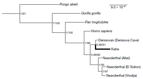
|
That's a genealogy chart of several hominids. You can see that the Xiahe specimen (thick line) clusters close to the Denisova Cave sample.
What's the basis of that grouping? The Xiahe sample has not yielded any usable DNA. However, it has yielded some protein (collagen). Sequencing of ancient proteins is another recent development -- and that is the basis of the grouping shown here. This is Figure 2 from the article. |
How good is the story that the Xiahe specimen is Denisovan (or closely related)? Perhaps the biggest uncertainty is simply the limited amount of data at this point. "Denisovan" and "Xiahe" are each defined by one sample. The progress with Denisovans over the current decade has been remarkable. This is one more step. We'll see how it holds up.
Further comments...The Xiahe specimen is dated to about 160,000 years ago. It is older than the Denisova Cave specimens. It is also the oldest known human sample from the Tibetan Plateau.
The specimen was found in 1980. What's new here is the analysis.
Although the only physical specimens of Denisovans were from Siberia, the genetic evidence has pointed to a widespread distribution, especially through east Asia. It has been hoped for some time that analyses of specimens from China would turn up Denisovans there. Xiahe would appear to be step 1 in that direction. Surely, there are more Denisovans to be found in China. We also note that knowing this one jaw may bring attention to other samples that look similar in existing collections.
Previous genetic work had indicated that modern Tibetans got genes for survival at high altitude from Denisovans. Finding that the Denisovans were the first people in the Tibetan highlands complements that nicely.
News stories:
* Denisovan Fossil Identified in Tibetan Cave -- A mandible dating to 160,000 years ago is the first evidence of Denisovan hominins outside the Russian cave where they were first discovered in 2010. (S Williams, The Scientist, May 1, 2019.) Now archived.
* Scientists found that the Tibetan Plateau was first occupied by Middle Pleistocene Denisovans. (Institute of Tibetan Plateau Research, Chinese Academy of Sciences, May 2, 2019.) From one of the lead institutions involved.
* How We Found an Elusive Hominin in China -- An ancient jawbone collected by a monk has been identified as the first Denisovan discovered outside of Siberia. (J-J Hublin, SAPIENS, May 1, 2019.) By one of the authors of the article. Excellent overview of the work, with good context.
The article: A late Middle Pleistocene Denisovan mandible from the Tibetan Plateau. (F Chen et al, Nature 569:409, May 16, 2019.)
Among posts on Denisovans...
* Contributions of Neandertals and Denisovans to the genomes of modern humans (July 6, 2016).
* The Siberian finger: a new human species? (April 27, 2010). The original post, about the first article.I usually don't refer back to "Briefly noted" items, but there are two that deserve mention here...
* Briefly noted... Denisova Cave (April 10, 2019).
* Briefly noted... A Neanderthal-Denisovan hybrid (August 29, 2018).Among posts about ancient proteins:
* Reconstructing an ancient enzyme (February 26, 2019).
* Did the Neandertals make jewelry? Evidence from ancient proteins (February 26, 2017).More jaws... How to clamp down to keep the partner from straying (December 15, 2020).
May 5, 2019
What's Y-Y? Two atoms of yttrium joined by a single covalent bond.
The rare earth metal yttrium is a useful catalyst, but its chemistry is not well understood.
A new article reports the first observation of Y-Y bonds. They are a bit unruly; it helps to keep them caged.
The first figure is a drawing showing the structure of a cage with an yttrium dimer inside...
|
Y2@C82. The @ sign means "inside of". That is, this is Y2 inside a C82 cage. It is a well-defined molecule; the Y2 can't get out.
The Y-Y is shown in blue. This is part of Figure S10a from the article supplement. |
The "cage" is a fullerene. This one is somewhat larger than the classical C60; many sizes of fullerenes are known. It wasn't long after fullerenes were first characterized that people started finding things inside them. The term endohedral was coined for such things, and the @ sign introduced to denote the unusual relationship.
The following figure shows some detail of that compound -- and more...

|
Part a (top) shows the same chemical as above. This drawing shows a cut-away to make it easier to see the bonding inside the cage. You can see that there are two Y atoms, with a bond of about 3.6 Å (Ångstroms) between them. That's just about the bond length predicted. The structure shown here is based on X-ray crystallographic measurements. That is the evidence for covalent Y-Y single bonds. Such bonds are found in this chemical, and a closely related one in the study. |
|
The study also showed something different in some cases. This is illustrated in part d (the bottom structure of this set). It's another cage, similar but a little bigger: C88. And it has 2 Y atoms. But in this case, there is also a C2 unit inside the cage, with a Y on each side of it. That is, this is Y2C2@C88. The distance between Y atoms here is nearly 4.3 Å, considerably more than the directly-bonded Y-Y distance of the previous case. The dihedral angle shown on the figure is the angle between the planes of the two triangles formed by the C2 and one of the Y. (At least, I think that is what it refers to. It doesn't seem to say.) This is part of Figure S8 from the article supplement. | |
So the study reveals two kinds of structures: cages with Y-Y and cages with a non-linear Y-C2-Y. The scientists found Y-Y in C82 cages, and the more complex structure in larger cages.
One should remember how these compounds are made. One does not set out to make a specific fullerene chemical. Instead, carbon material is burned at high temperature. The resulting soot is studied for its content of fullerenes, the cage chemicals. In the current work, the burning was done in the presence of yttrium oxide, so some of the resulting cages contained Y.
The work involved purifying and characterizing individual components from the soot. That experimental work was accompanied by theoretical work, predicting the properties of such Y-containing cages.
Overall, the work here enhances our understanding of an unfamiliar element.
News story: Fullerene cage stabilises first yttrium-yttrium single bond. (T Easton, Chemistry World, April 16, 2019.)
The article, which is freely available: Crystallographic characterization of Y2C2n (2n = 82, 88-94): direct Y-Y bonding and cage-dependent cluster evolution. (C Pan et al, Chemical Science 10:4707, May 7, 2019.)
Other posts that mention yttrium:
* Superconductivity in lanthanum hydride: a new temperature record (June 8, 2019).
* Penidiella and dysprosium (September 11, 2015). Notes the terminology of rare earth elements and lanthanoids.
* Lead-rich stars (August 30, 2013).Among posts about unusual chemical bonds...
* Imaging Re2 molecules (March 10, 2020).
* A chemical bond to an atom that isn't there (October 31, 2018).Don't confuse the Y-Y of the current post with the YY of a previous post... YY in the mouth? (April 4, 2014).
More soot: Microbes that make elemental carbon (November 27, 2021).
Also see...
* Graphullerene (March 20, 2023).
* A new form of carbon: C18 (September 24, 2019).This post is listed on my page Introductory Chemistry Internet resources in the section Lanthanoids and actinoids.
May 3, 2019
Do you have separate jackets for "cool" and "cold" weather? What if you could just use a single jacket, and throw a switch on it to change it from being a cool-weather jacket to a cold-weather jacket? Better yet, what if the jacket knew how cold you were, and just made the switch by itself?
A recent article offers a step toward the development of such an intelligent jacket.
To start, we need to understand how a jacket works to keep you warm. It's actually simple... Your body gives off heat -- as infrared (IR) radiation. The jacket traps the IR. As a result, you benefit from that heat you gave off.
If you get too warm, you take off the jacket. It would be easier if you could just tell the jacket to let some of the IR through. And easier still, if the jacket took action on its own. How could the jacket tell if you got too warm? You start to sweat. The humidity goes up. So, if the jacket responded to higher humidity by allowing IR to go through, it would serve the purpose.
Here's some data...
|
The graphs show the IR transiittance of two materials as the humidity changes.
It would have been simple if the authors had plotted IR vs humidity, but they did it differently. The graphs show both IR and humidity over time. IR is shown with the dark curve (and left-hand y-axis scale); humidity is shown with the light curve (right-hand y-axis scale). The big picture... In one case the two curves are similar; as humidity increases, so does IR transiittance. In the other case, they are not; the IR transiittance remains fairly constant -- and low -- as the humidity changes. This is part of Figure 4 from the article. |
The upper graph is for the new material that the scientists have designed. They call it a metatextile. The lower graph is for the control material. Accompanying thermal analyses (by IR imaging!) show that the new material becomes cooler as the humidity rises.
What is this new material? It's based on a common textile yarn, but modified so that it responds to humidity by changing structure and IR transmission. A key part of the modification involves carbon nanotubes.
The following figure shows the idea...

|
The squiggly lines show the IR (as labeled in one case, lower left). The IR at the bottom is what the person gives off; the IR at the top is what passes through the fabric. On the left side, the squiggly lines at top and bottom match. The material lets IR pass through. On the right side, the squiggly lines at the top are small, showing that IR loss from the material is low.
Look at the arrows showing the transition. "Cold/dry" shifts the material to the right, where it blocks IR loss and keeps you warm. "Hot/wet" shifts the material to the left, where it irradiates and keeps you cool. The terms open and closed may be confusing. The authors' use the terms to refer to transmission of IR. But we also note... What's shown here are the individual yarns. The tighter an individual yarn, the more open the overall fabric. This is part of Figure 1 from the article. |
Overall... When the humidity changes, the fabric structure changes. That happens because the fabric has a mixture of hydrophobic and hydrophilic regions. Therefore, it is distorted when the humidity changes. That changes the bulk porosity of the fabric. It also changes the organization of the carbon nanotubes -- and that changes the IR transmission. Together, the two effects (on bulk porosity and IR transmission) help the material retain heat when cool, but lose heat when warm.
So that's the idea... If you get too hot, you sweat. Your jacket responds by letting heat out. At least in principle, the current article shows how it works.
What if it rained? The authors acknowledge (in one of the news stories) that could be a problem.
News stories:
* 'Cool' Textile Automatically Regulates Amount of Heat that Passes through It. (Sci.News, February 11, 2019.)
* Smart textile uses sweat as switch to keep wearer cool or warm. (J Urquhart, Chemistry World, February 8, 2019.) (They mix up the water binding properties of the fabric components. Whoops. And this is a chemistry site!)
The article: Dynamic gating of infrared radiation in a textile. (X A Zhang et al, Science 363:619, February 8, 2019.)
A post about controlling IR transmission by windows... Windows: independent control of light and heat transmission (February 3, 2014).
Among posts about sweat: What if your house could sweat when it got hot? (November 30, 2012).
Posts about carbon nanotubes (and related structures) are listed on my page Introduction to Organic and Biochemistry -- Internet resources in the section on Aromatic compounds.
Older items are on the page Musings: January-April 2019 (archive).
The main page for current items is Musings.
The first archive page is Musings Archive.
E-mail announcements -- information and sign-up: e-mail announcements. The list is being used only occasionally.
Contact information Site home page
Last update: April 24, 2026